AI fitting room
Project overview
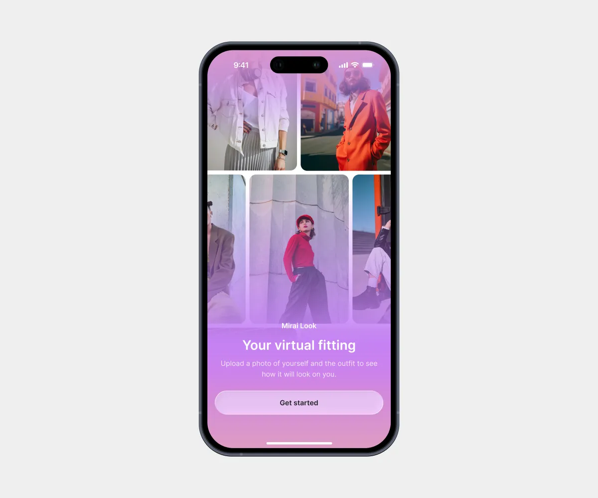
An AI-powered mobile app that shows users how clothes and accessories will look on them. Users can try on items before buying online and create different looks without prompts.
My collaboration:
Weekly sync meetings with developers and presentations of design solutions.
Goals
Main task:
Design the MVP of an iOS AI startup with an appealing interface aimed primarily at a female audience.
Challenges:
- Speed up photo selection so users don’t have to upload a photo every time;
- Make sure clothes are applied to the correct body part;
- Let users fix the try-on result.
Constraints:
- Latest iOS Human Interface Guidelines;
- 2 weeks for design.
My role
Role:
UX/UI Designer (solo)
Key responsibilities:
- Meetings with developers;
- Generating hypotheses;
- Visual style;
- UX/UI design;
- Presenting design solutions;
- UI kit;
- Design QA.
Solution
My design process:
- UX: Brief analysis, competitor analysis, proto-personas, user flow.
- UI: Design concept, multiple solution options for key features, design of all screens.
- Handoff: UI kit, layer naming, styles, components, development support, Design QA.
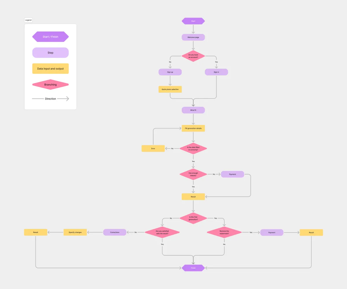
I started by mapping the user flow of the main scenario. This made it possible to cover all interface states in the design without separate prototypes.
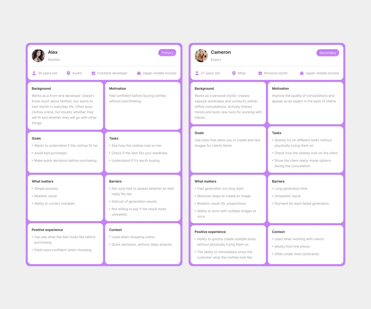
Two proto-personas turned a vague idea of the audience into clear user profiles. I used them to make design decisions and defend them with specific scenarios, and the team discussed the product based on a shared understanding of the audience rather than personal interpretations.
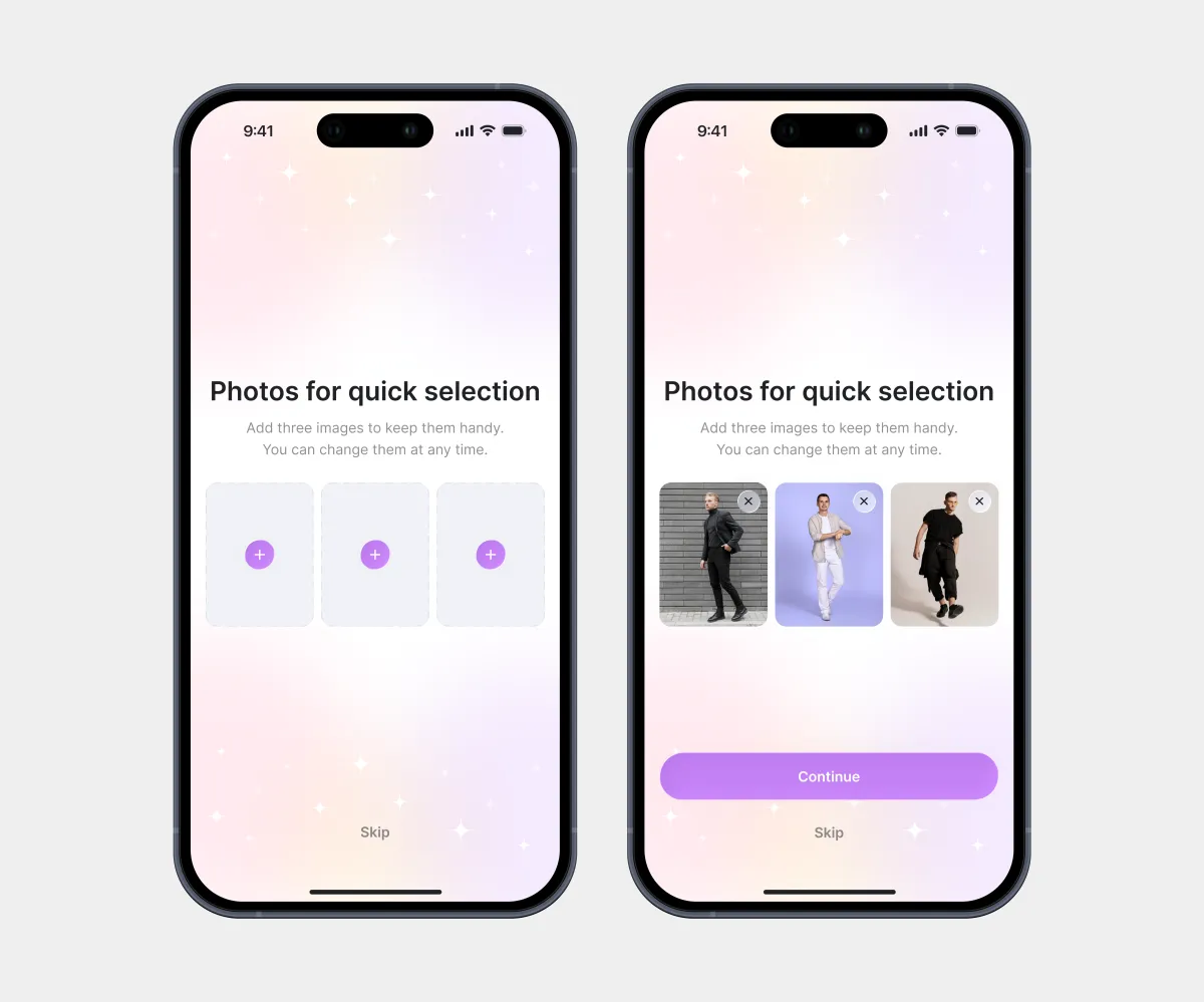
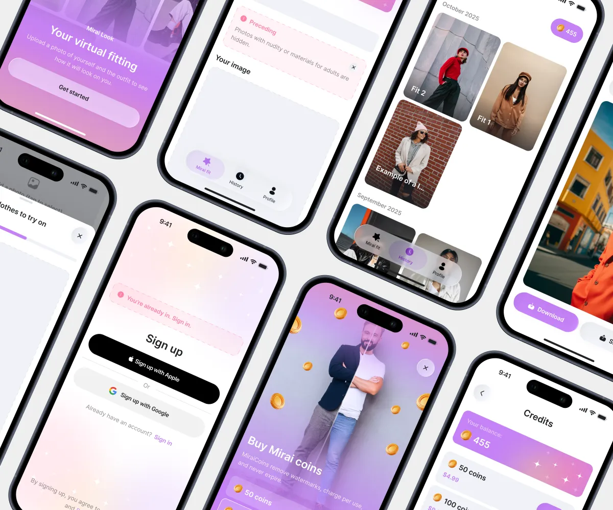
Uploading photos again and again slows users down, so ready-made selections make the process much faster.
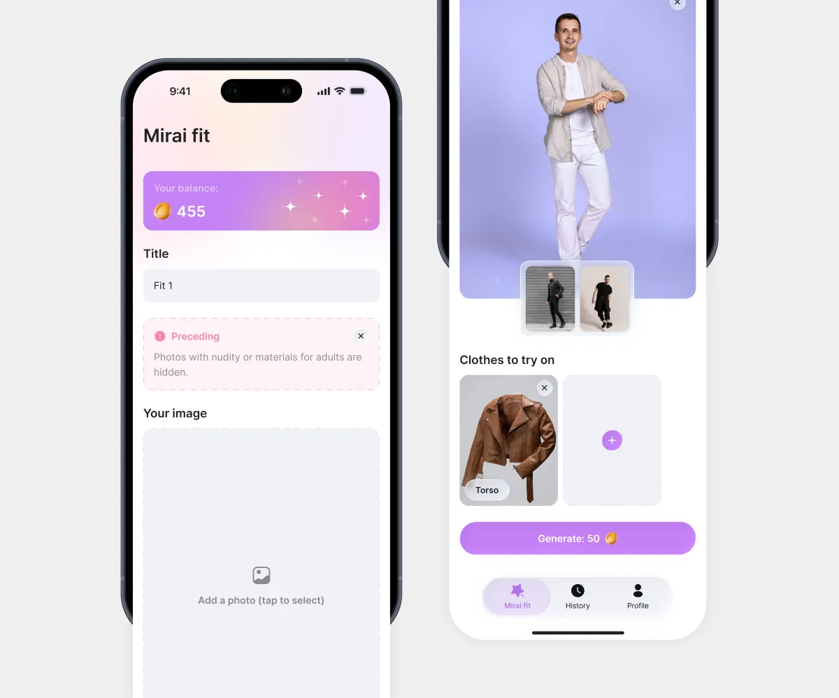
Key settings sit on the main screen, while secondary actions are split into separate steps. As the user scrolls, the balance smoothly moves into the top bar.
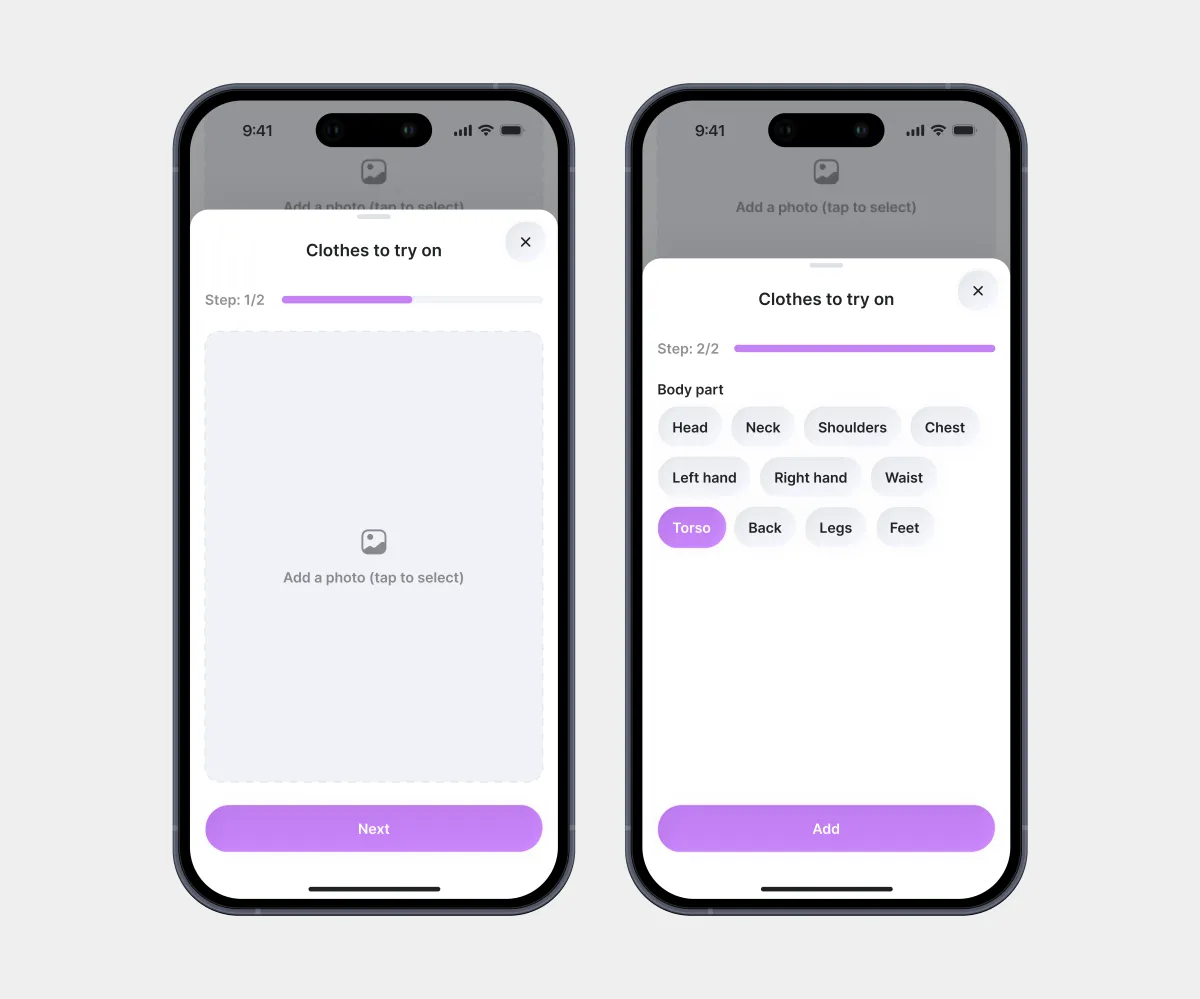
Adding clothes is split into two steps: photo → body part. This simplifies the main screen and delivers more accurate results.
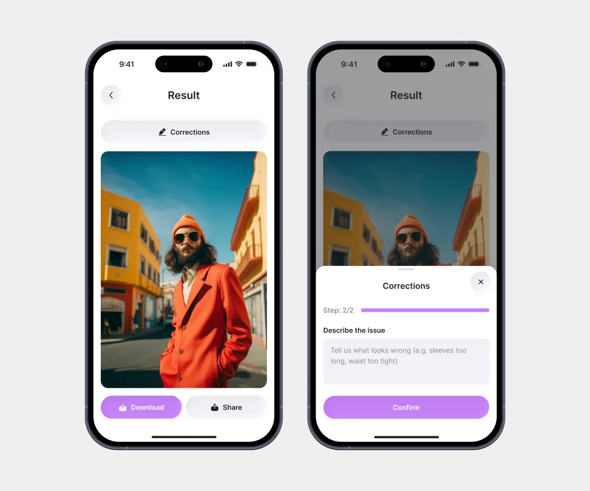
The Corrections feature lets users refine the try-on result without spending credits.
Conclusion
Results:
- 39+ screens;
- Delivered the MVP design on schedule;
- The interface follows the iOS Human Interface Guidelines;
- All required features integrated into the product;
- Pixel-perfect match between the design and the final implementation.
What I learned:
- Working with developers at every stage of the design process;
- Presenting and defending design decisions;
- Applying the iOS Human Interface Guidelines in practice.