AI tutor
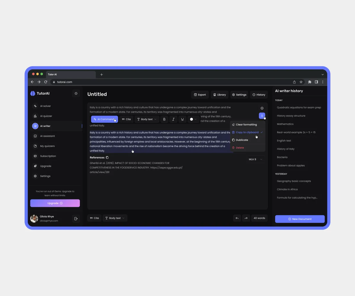
Project overview
An AI-powered learning platform that supports users at every stage of learning: writing essays, creating quizzes, preparing for exams, and more. Suitable for students, teachers, and parents.
My collaboration:
Aligned requirements with the Project Manager, worked alongside the other designers on the project, and validated solutions with the Team Lead during design reviews.
Goals
Main task:
Design the website, platform, and adaptive versions in light and dark themes, starting with wireframes. Create a modern AI-inspired visual style with gradients. Use the main competitor and an existing AI-generated platform as a foundation, improving the user experience through a redesign. Create a UI kit.
Challenges:
- Unite multiple AI tools within a single intuitive navigation;
- Build trust in AI;
- Make both themes equally comfortable to use;
- Balance an AI assistant with a human approach.
Constraints:
- Existing references;
- No access to users for interviews or usability testing.
My role
Role:
UX/UI Designer
Key responsibilities:
- Meetings with the Project Manager and Team Lead;
- Visual style;
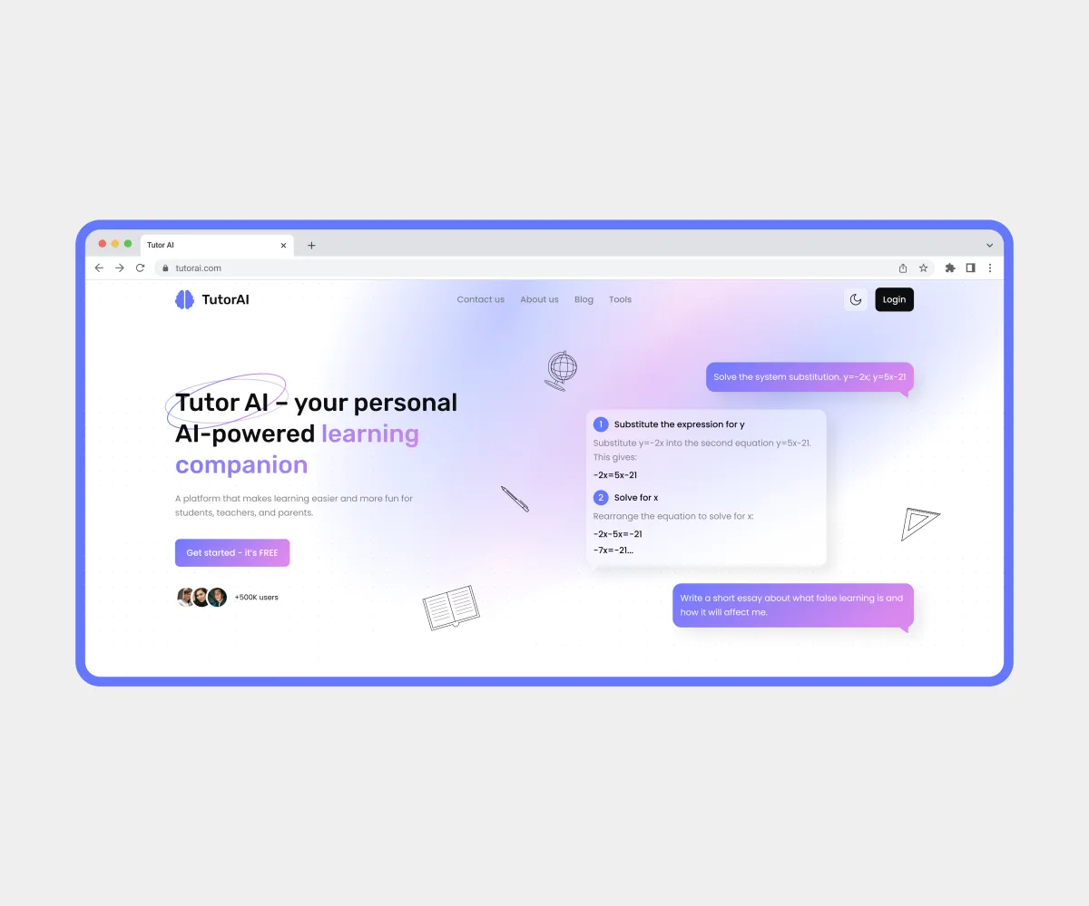
- Website homepage;
- Platform sections: AI Solver, My Quizzes, Subscription, Upgrade, and Settings, plus parts of AI Quizzer and AI Writer;
- Light and dark themes;
- Collaboration with the design team;
- Preparing the design file for handoff.
Solution
My design process:
- UX: Brief analysis, meeting with the Project Manager, wireframe and competitor analysis.
- UI: Reference analysis, design concept, website homepage and platform sections in both themes.
- Handoff: Layer organization, color and text styles, component states.
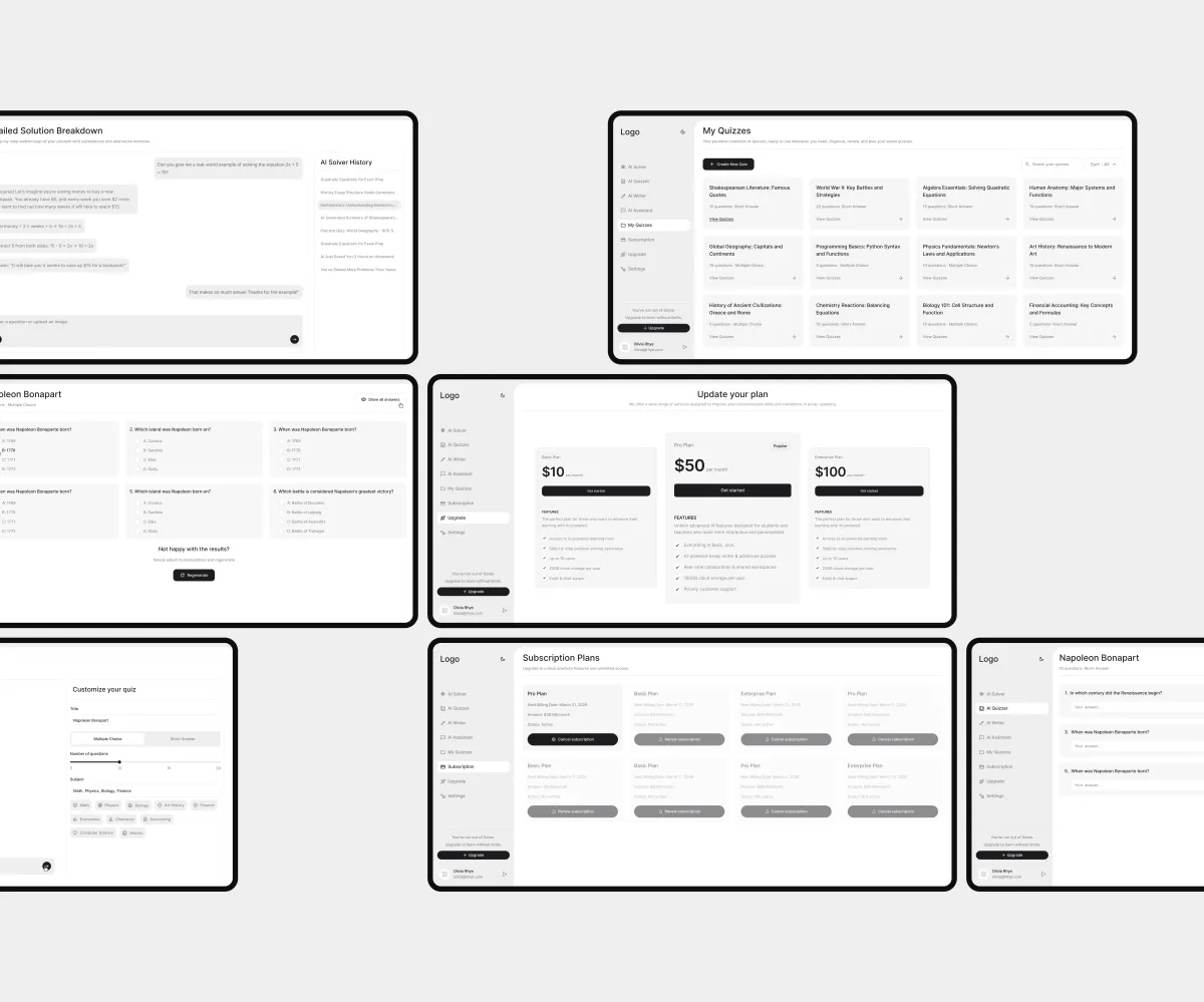
The wireframes helped the team focus on the platform’s usability and functionality, align the product structure with the client, and speed up UI design by making it easier for new designers to join the project.
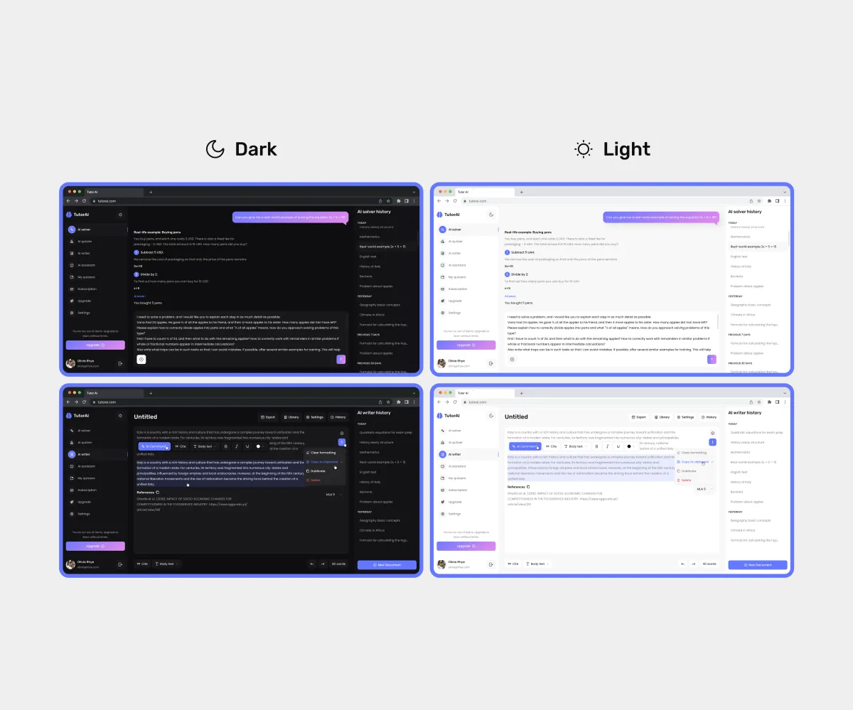
Light and dark themes make the experience more comfortable and adapt to different usage conditions and user preferences.
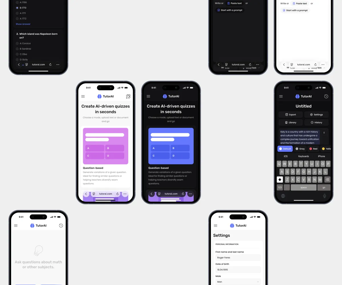
The adaptive design keeps the experience consistent and convenient across all devices.
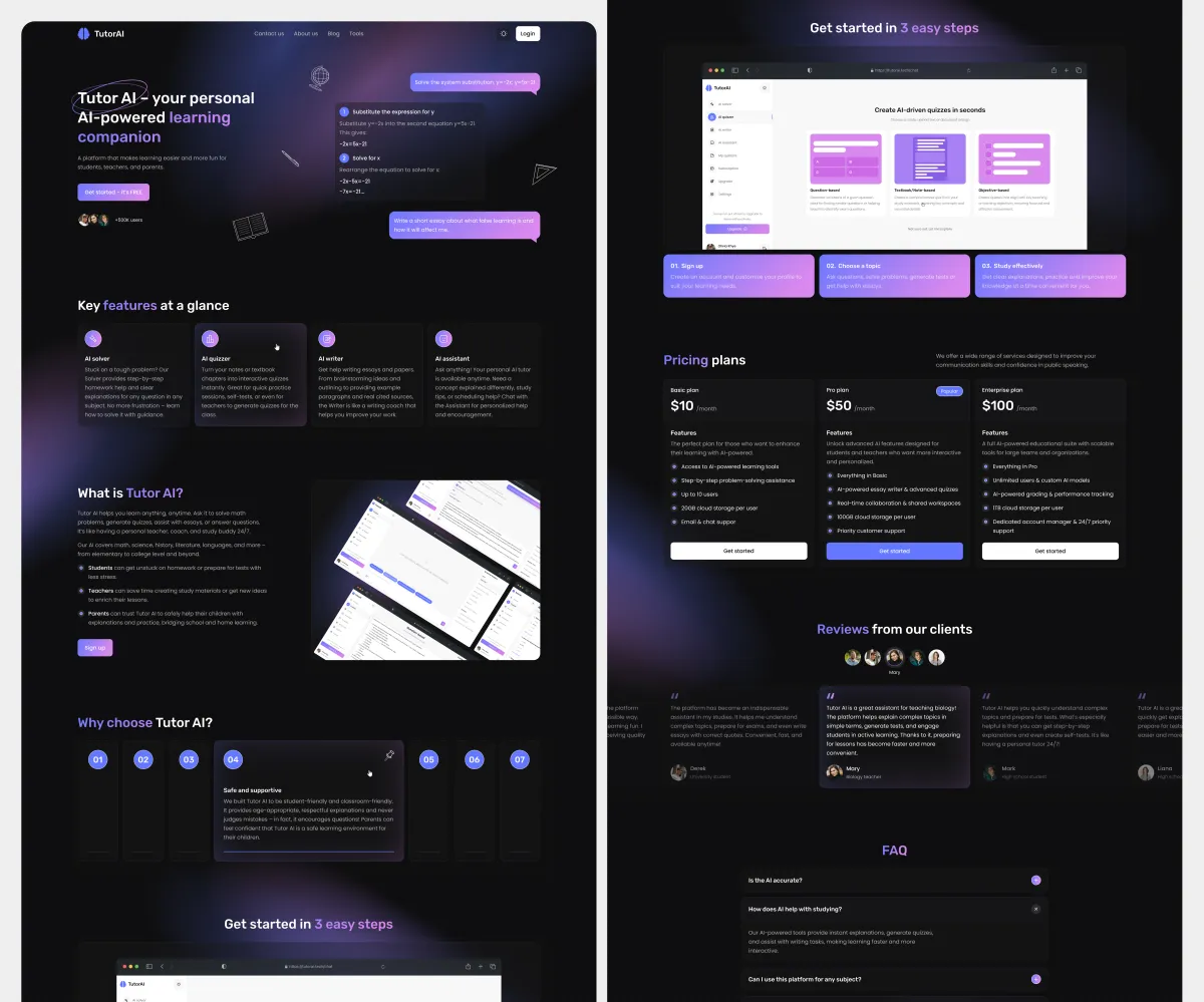
The website explains the product’s value and key features and encourages users to start using the platform.
Conclusion
Results:
- 265 screens: 53 wireframes, plus 53 desktop and 53 mobile layouts, each in light and dark themes;
- Improved the platform’s navigation;
- Delivered a visual style aligned with the client’s expectations and references;
- Finalized the design in both themes and the adaptive version;
- Approved after the second iteration.
What I learned:
- Working on large SaaS/EdTech platforms where consistency across dozens of screens is essential;
- Making design decisions within an already defined product structure.