Design system
Project overview
A mobile startup for small businesses that needed its own identity and a foundation for scaling the product.
My collaboration:
Took over the project from another designer and continued their work. Aligned requirements with the Project Manager and validated solutions with the Team Lead during design reviews.
Goals
Main task:
Create moodboards to define the visual style, a logo, a logobook, a design system, sample mobile app screens, a landing page hero section, and social media templates based on a detailed brief. The goal was to speed up future development and build a scalable foundation for product growth.
Challenges:
- No existing visual identity or design system;
- Quickly establish a visual style that builds trust among small business users;
- Reduce the risk of inconsistencies in future interface development.
Constraints:
- The design system had to be built before the interfaces;
- Tight deadlines before the product launch.
My role
Role:
UX/UI Designer
Key responsibilities:
- Meetings with the Project Manager and Team Lead;
- Design system;
- Logobook;
- Mobile app screens and landing page hero section;
- LinkedIn and Facebook templates;
- Preparing the design file for handoff.
Solution
My design process:
- UX: Brief analysis, interviews with the Project Manager and the previous designer, audit of existing assets (logo, moodboards), market and competitor research, study of how established design systems are structured.
- UI: Design system, 4 mobile app screens, landing page hero section, logobook, social media templates.
- Handoff: Layer naming, styles, variables, components and variants, documentation with guidelines, UI kits.
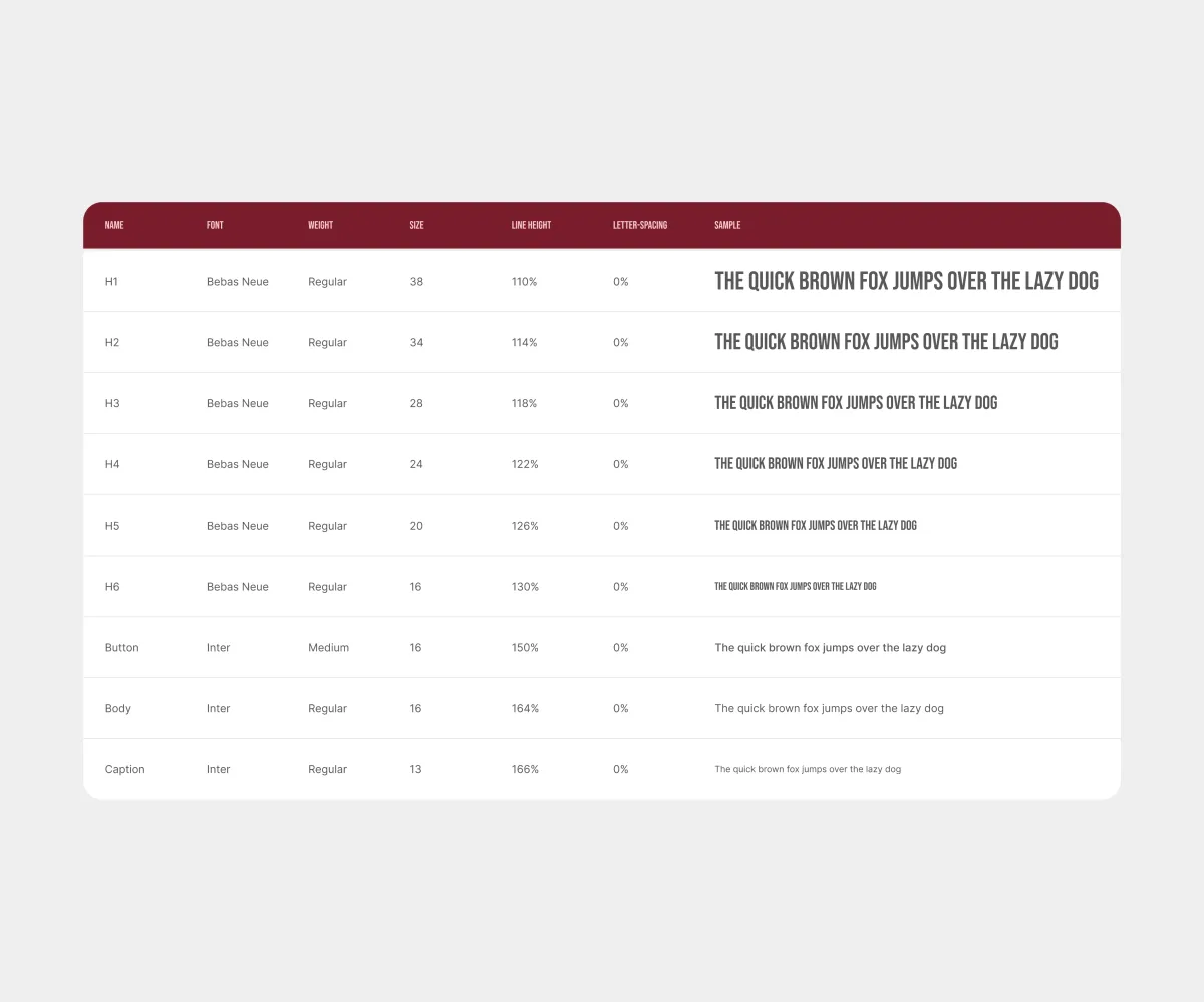
The font pair was chosen based on the approved moodboard. Text styles are built on variables: Text Style → Type Scale (font, weight, size, line height, tracking). A separate Font Theme collection lets you replace the font pair across all styles in a few clicks.
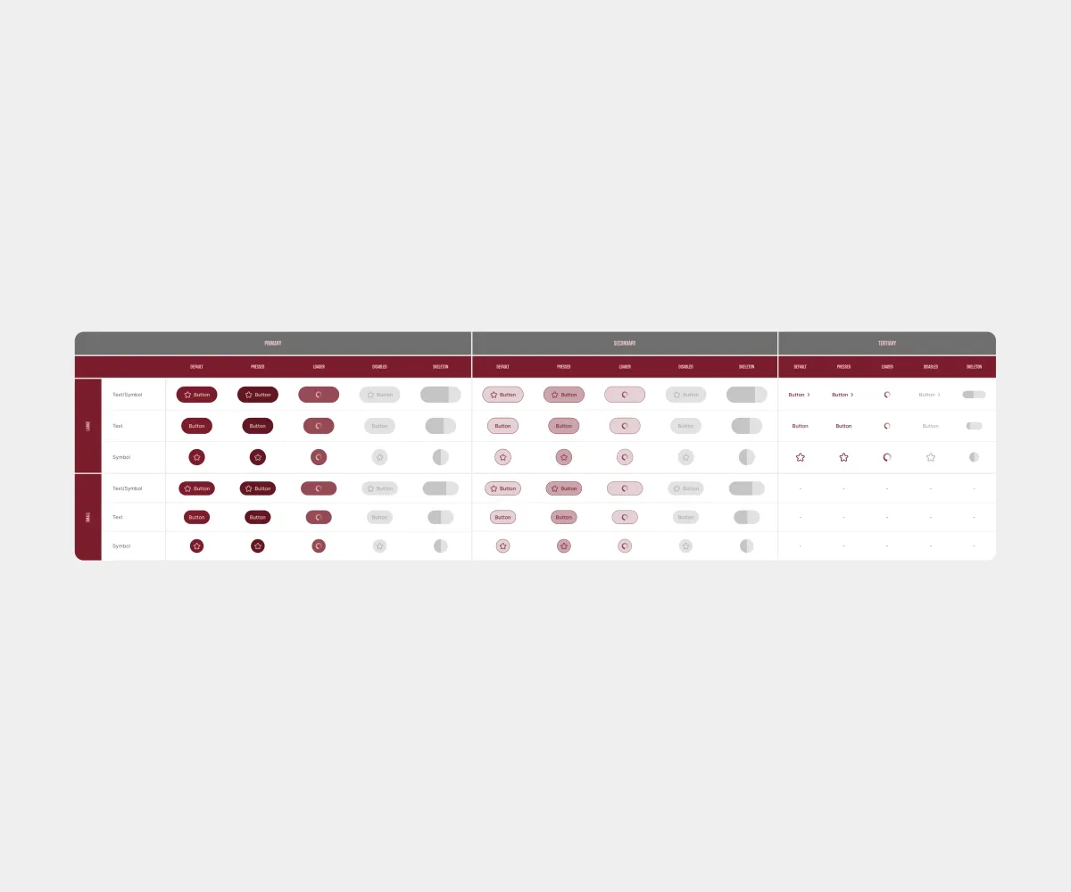
Three button styles: Primary, Secondary, and Tertiary. Each component lets you customize the label, icon, size, and other properties.
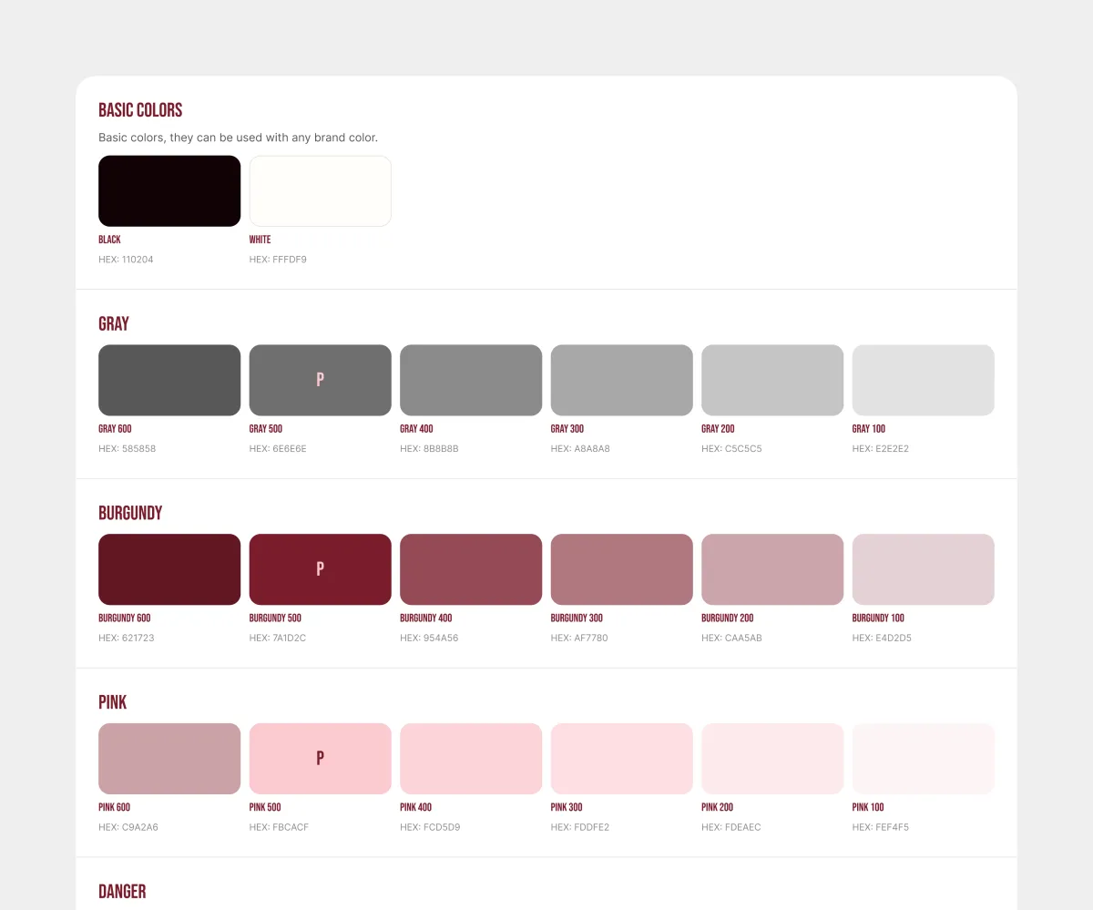
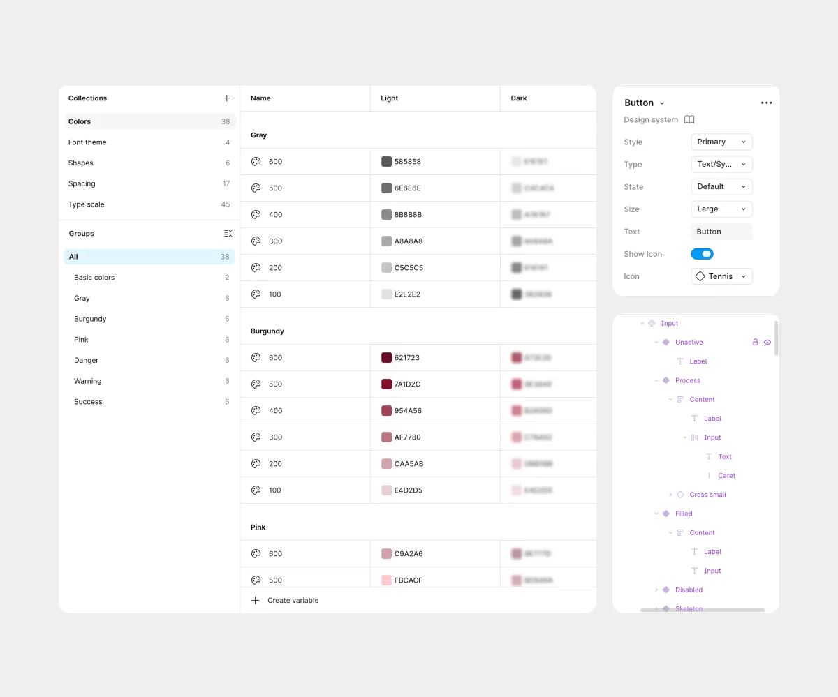
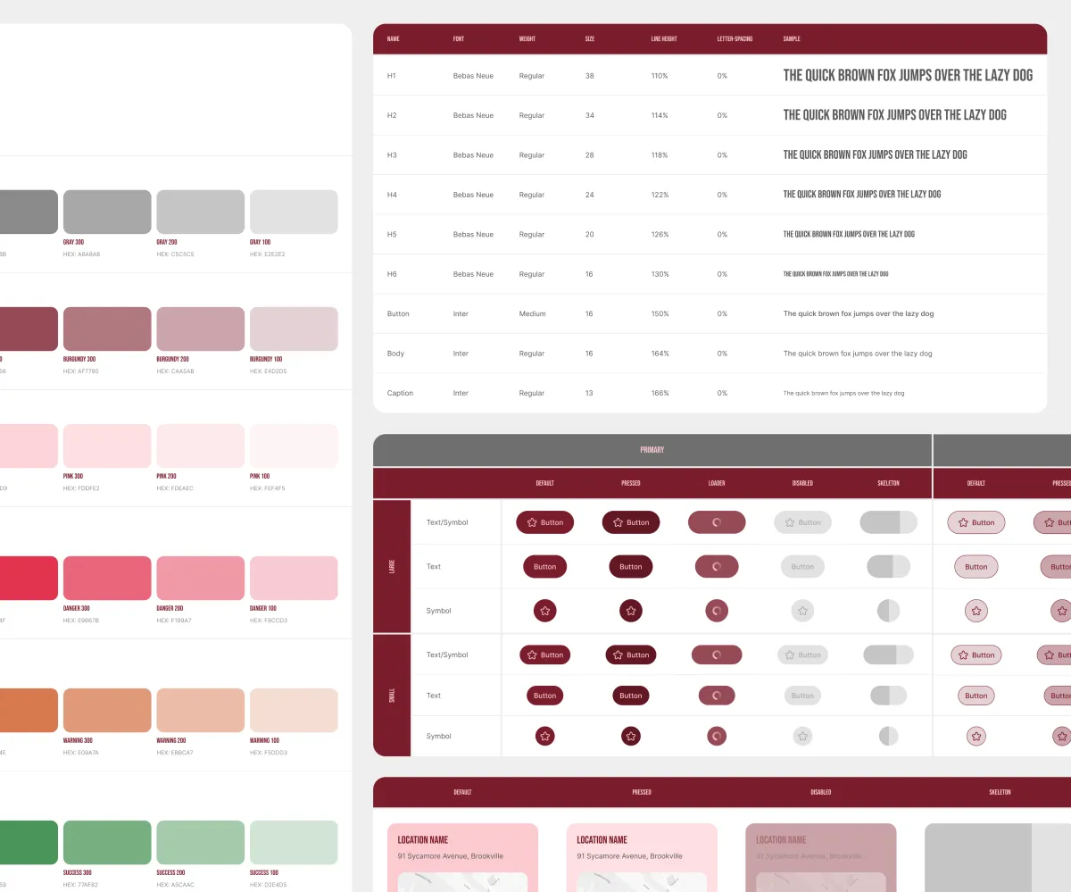
The palette has three groups: Base, Brand, and Semantic. Brand colors come from the moodboard and provide strong contrast, with pink staying readable on gray and burgundy. A basic dark theme was added for accessibility.
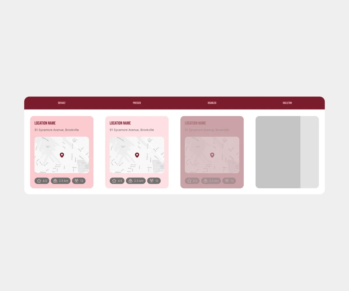
Cards have multiple states, including skeleton loading, which previews the page structure while content loads and feels smoother than a standard loader. The system includes several card variants; the image shows one of them.
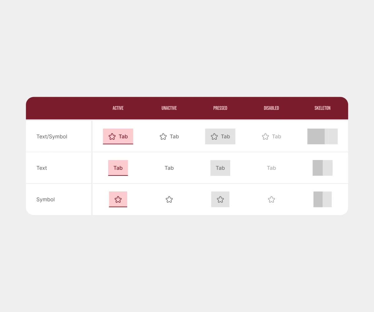
Tabs follow the same design, configuration, and behavior principles as the other components. Shared rules make the system predictable.
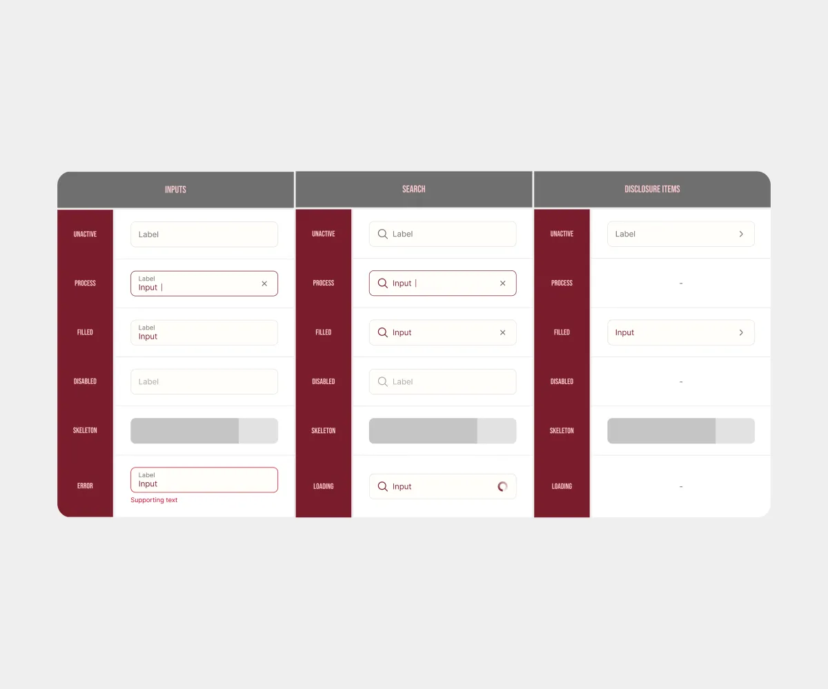
Input fields, search, checkboxes, radio buttons, labels, and tags work as one system. The relationships between components keep even a complex structure clear and scalable.
Conclusion
Results:
- Development became 25% faster;
- The design system was integrated into the product interface;
- Built a visual foundation for the product’s market positioning.
What I learned:
- Working with components, variables, and large-scale systems;
- Creating logobooks and social media branding.