Hidden object game
Project overview
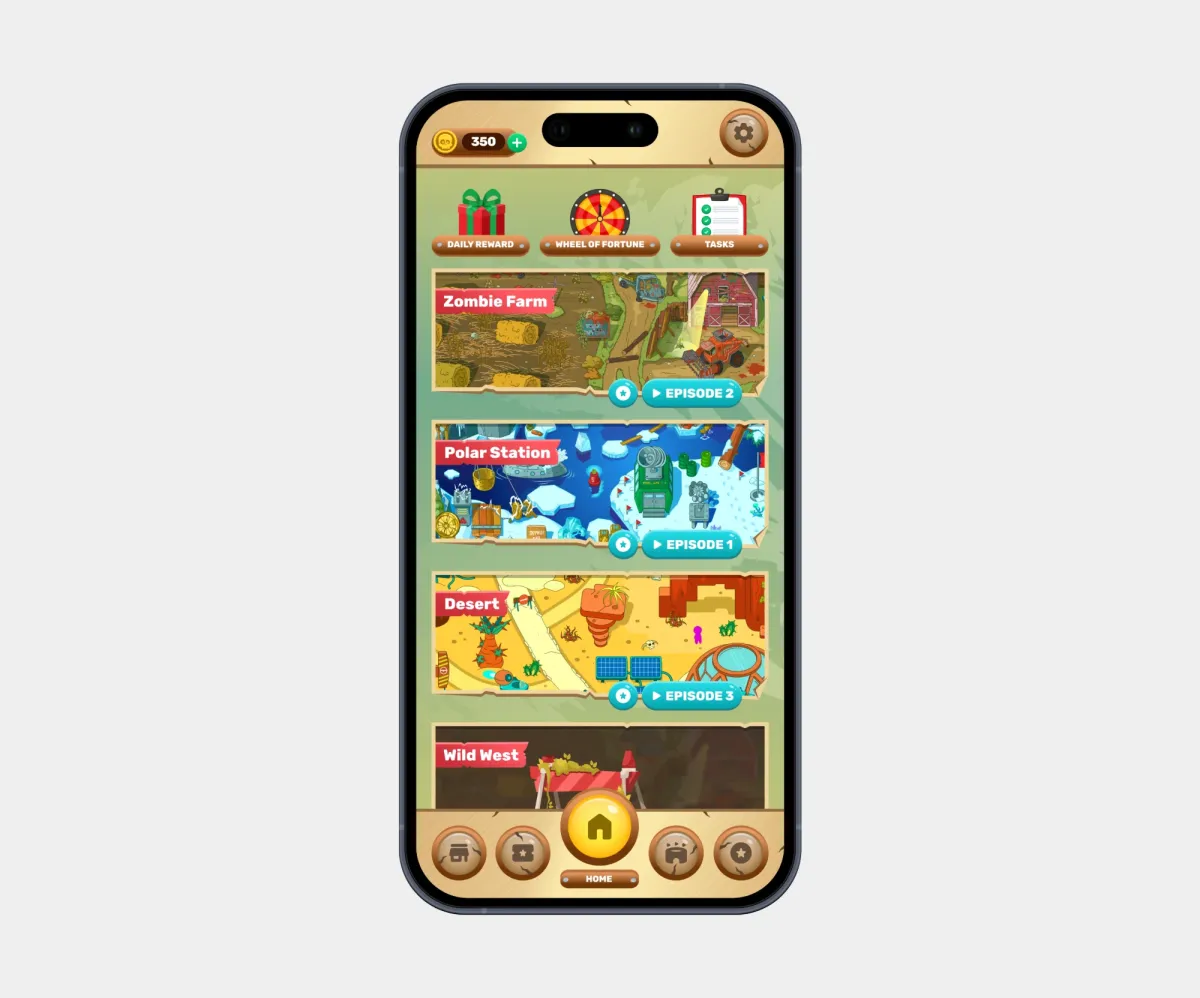
A casual mobile hidden object game where players search for hidden items in detailed scenes of a post-apocalyptic zombie world, solve logic mini-puzzles, and collect collectibles. The game is live on the App Store and Google Play.
My collaboration:
Calls with the Project Manager to align on project details and design reviews with the Team Lead.
Goals
Main task:
Design the interface of a mobile hidden object game in a themed zombie style based on a detailed specification, covering gameplay screens, the reward system, pop-ups, and system screens.
Challenges:
- Convey the game’s atmosphere through worn, aged textures, a pirate-inspired style, and themed illustrations;
- Work with a heavy design file full of vector details and textures;
- Design numerous game states (rewards, boosters, collections, win and lose) while keeping them clear and consistent.
Constraints:
- Tight deadline;
- No existing visual style or references, only the client’s wishes;
- A detailed specification with a predefined set of blocks and mechanics.
My role
Role:
UX/UI Designer (supporting designer alongside the Team Lead)
Key responsibilities:
- Calls with the Project Manager;
- Designing the logic of pop-ups that connect screens;
- Designing loading, reward, and settings screens;
- Searching for and selecting themed illustrations.
Solution
My design process:
- UX: Specification analysis, mapping transitions between screens and game states.
- UI: Designing pop-ups and the loading, reward, and settings screens within the visual concept created by the Team Lead; selecting illustrations.
- Handoff: Organizing layers and components in my screens.
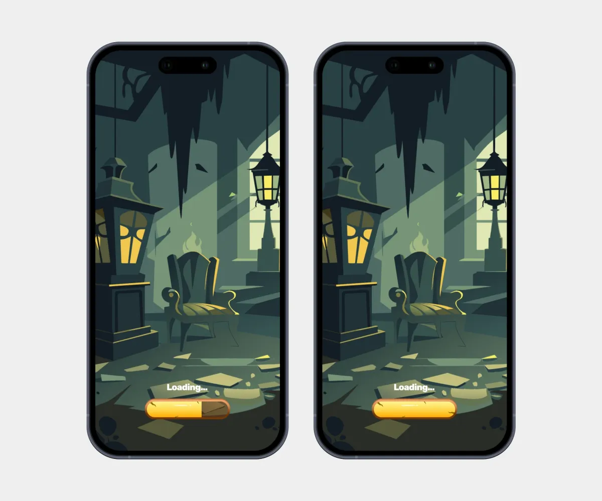
The loading screens immerse players in the atmosphere from the very first second with a dark scene, themed lighting, and a progress bar styled to match the game.
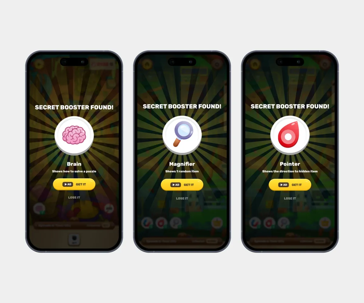
The “Secret booster found!” pop-ups reveal the found booster: Magnifier, Pointer, or Magnet. Each pop-up shows an icon, a short description of what the booster does, and a choice to claim it by watching an ad or skip. This builds monetization into a gameplay moment without abruptly interrupting the game.
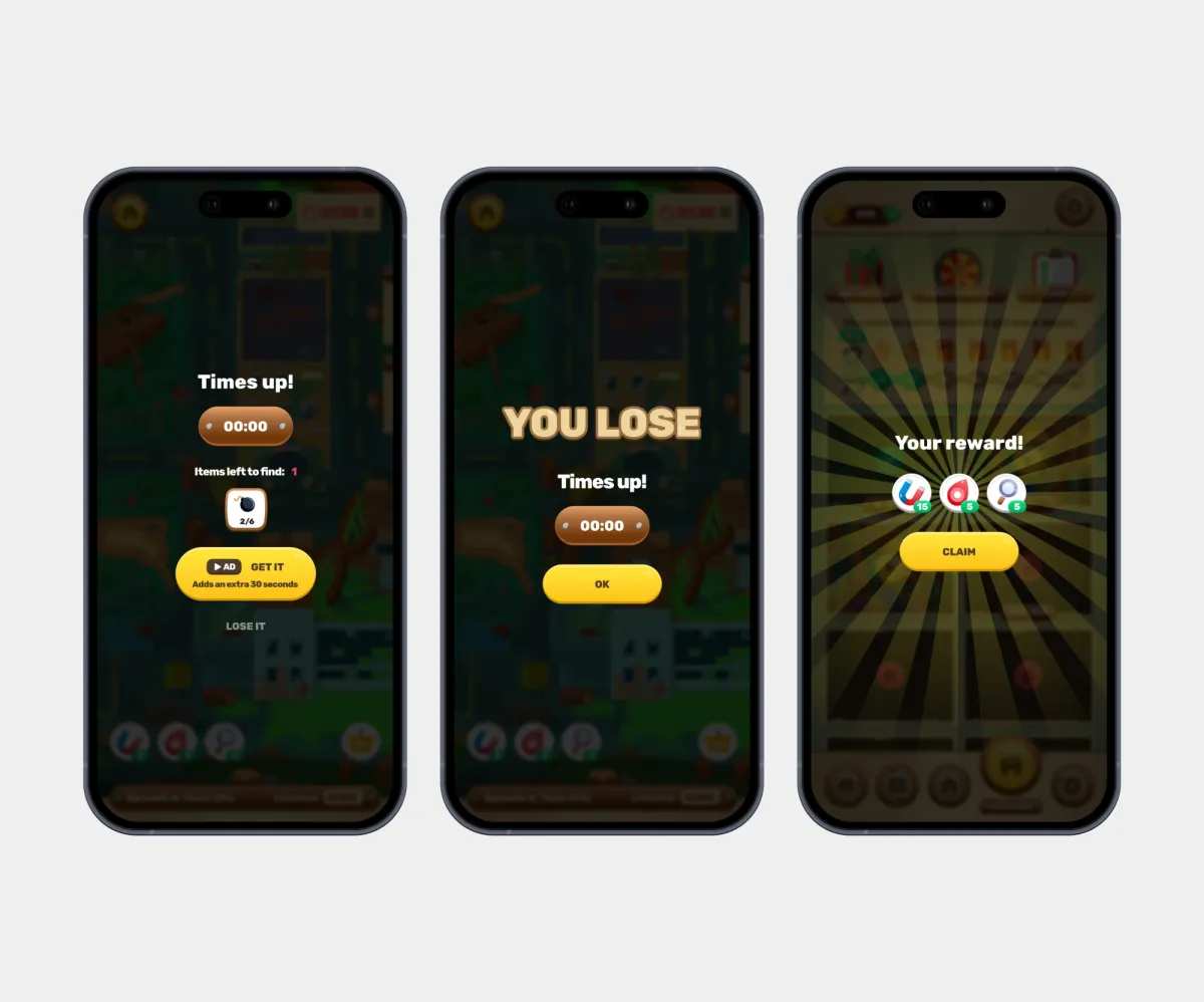
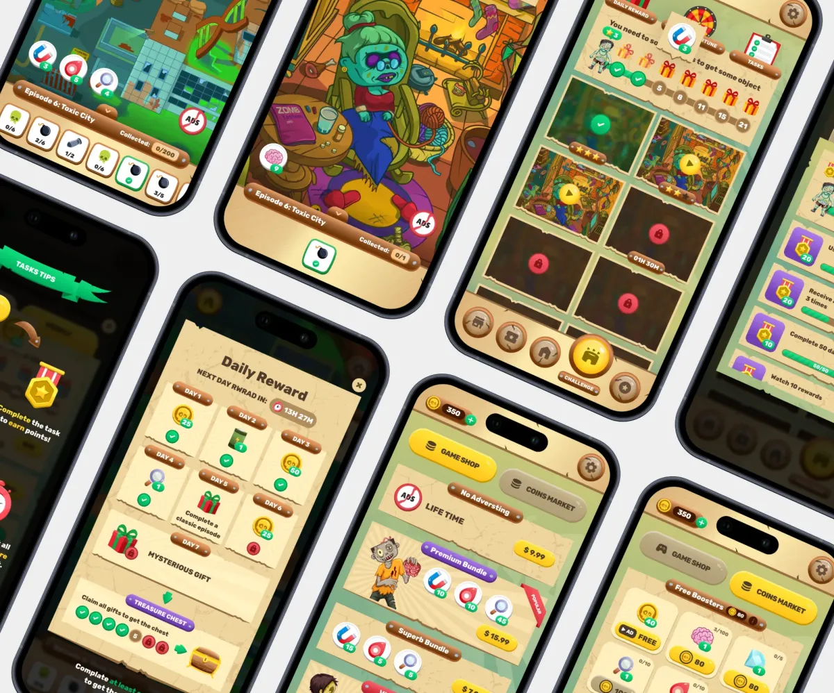
Separate states for win, loss, time running out, and rewards: Level completed, You lose, Time’s up, Your reward. Bright rays and large headings make the result feel rewarding, while the main action is always a single prominent button.
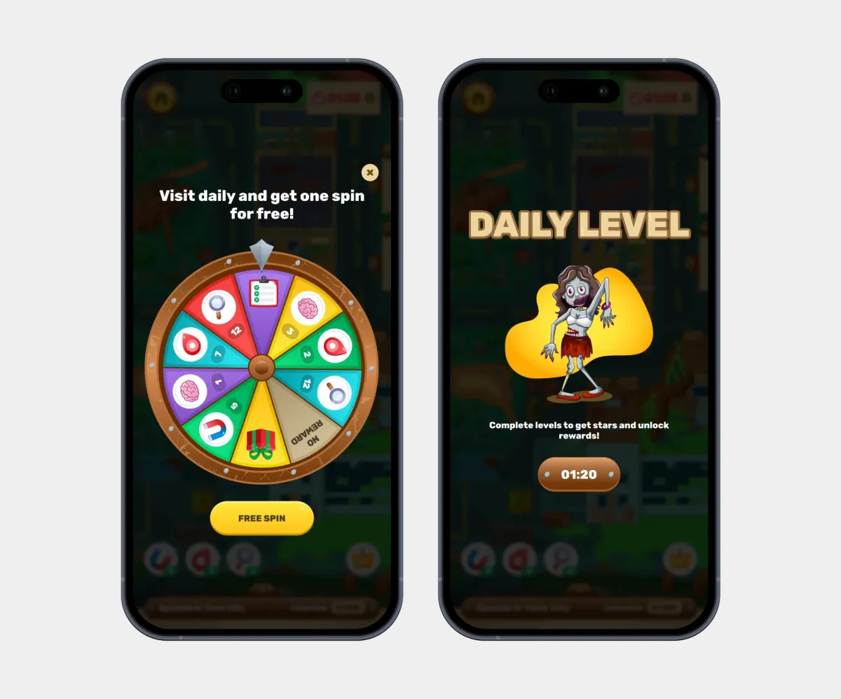
The Fortune Wheel, daily rewards, and the Daily Level motivate players to come back every day. The wheel’s states cover a free spin, a spin for watching an ad, and a timer until the next attempt.
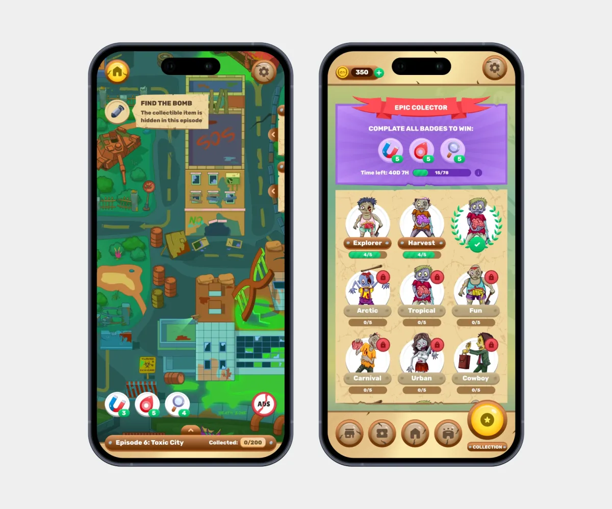
Pop-up hints let players know a collectible is hidden in the current episode without covering the game field.
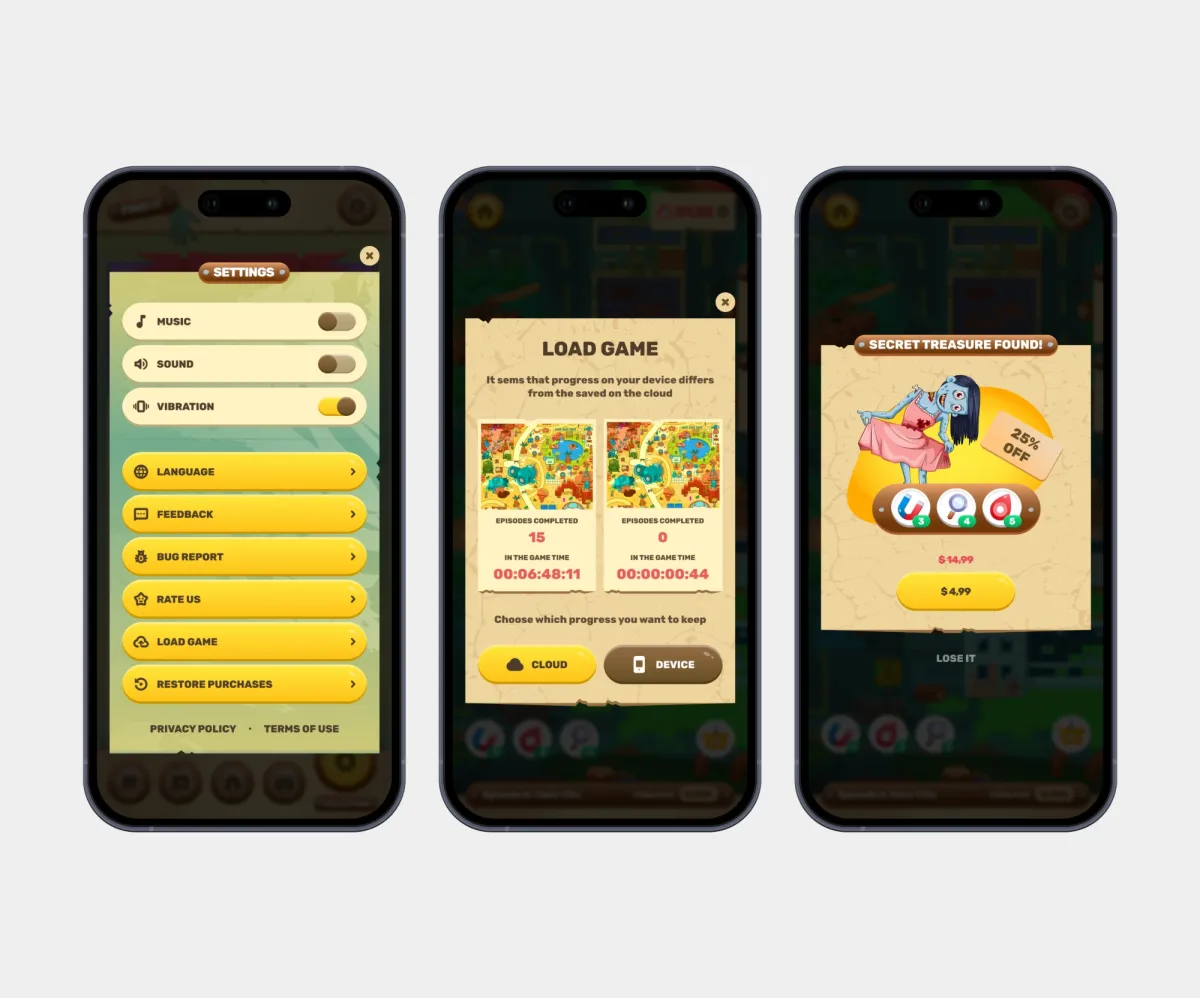
Settings, language selection, “Report a problem”, loading and overwriting saves, updates, and game rating share the same paper-textured style, so even system screens stay part of the game world.
Conclusion
Results:
- 80+ screens and states;
- Met the deadline;
- The game launched on the App Store and Google Play;
- 4.8 rating and 10K+ downloads on Google Play.
What I learned:
- Designing game mechanics and gamification: rewards, stars, collections, boosters;
- Working with a themed, highly detailed visual style.