Hospital app
Project overview
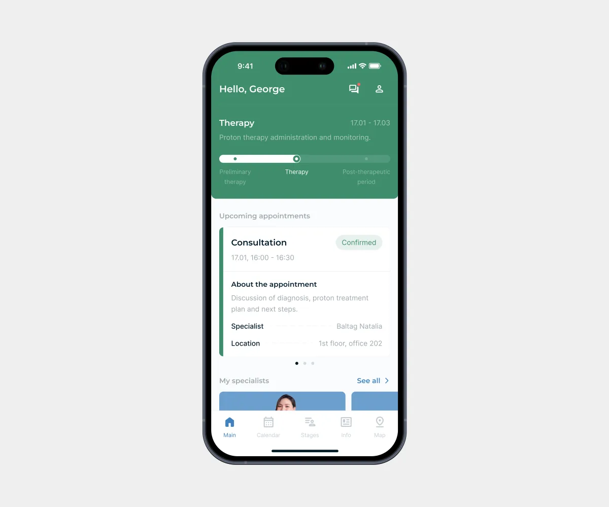
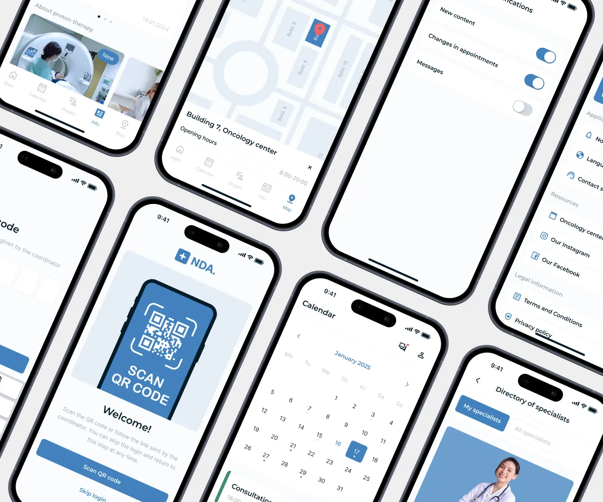
A mobile app for cancer patients that supports them throughout their treatment and helps them feel more confident and at ease. It brings together features that make the treatment process easier to understand and provides emotional support along the way.
My collaboration:
Aligned requirements with the Project Manager and validated solutions with the Team Lead during design reviews.
Goals
Main task:
Design a logical and scalable architecture for a complex medical system. Separate the treatment stages and make appointment booking fully digital.
Challenges:
- Account for patients’ emotional state: during treatment they need psychological support and an interface that is as simple as possible;
- Design only the core screens so internal pages can be easily added in the future;
- Simplify appointment booking.
Constraints:
- Tight timeline: 1.5 weeks;
- No wireframing phase;
- Strict adherence to the hospital’s brand guidelines.
My role
Role:
UX/UI Designer
Key responsibilities:
- Meetings with the Project Manager and Team Lead;
- Product architecture and user flows;
- UX/UI screen design;
- Preparing the design file for handoff.
Solution
My design process:
- UX: Task analysis, brand guidelines review, interview with the Project Manager, competitor analysis, product feature mind map.
- UI: Reference search, design concept, key screens.
- Handoff: Layer organization and naming, colors, text styles.
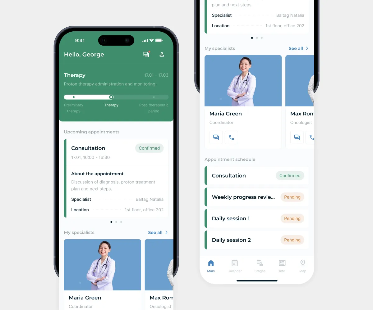
Treatment stages are shown as a progress bar, so patients see where they are and the value of each completed step. Below are upcoming appointments, specialists, and the schedule.
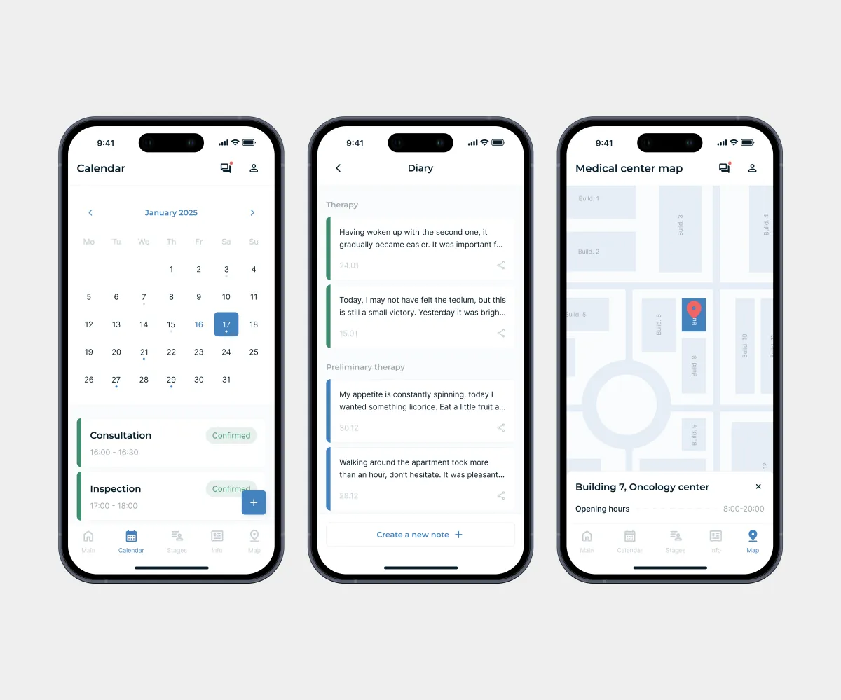
Calendar: Calendar indicators instantly separate upcoming appointments from past ones, with no need to open each day.
Diary: A private space for tracking physical and emotional well-being during treatment. Patients can share their notes with their doctor to get guidance or support.
Map: The map helps patients navigate hospital buildings and quickly find the right room. It solves one of the key pain points and makes it easier for new patients to adapt.
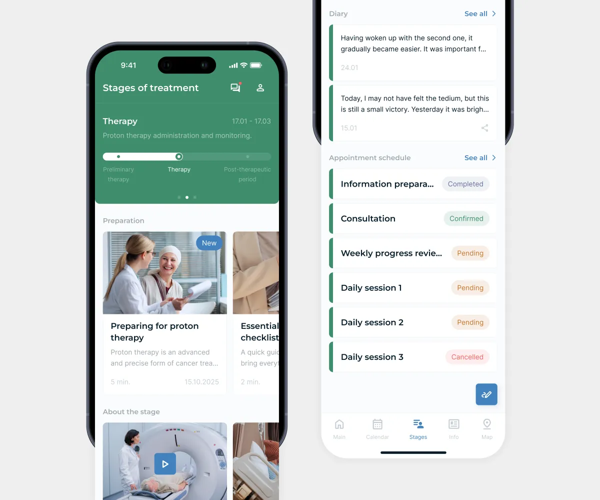
Each treatment stage has its own color throughout the app, making appointments, notes, and other content easy to tell apart. Since treatment isn’t always linear, color replaces extra labels and makes the design more distinctive.
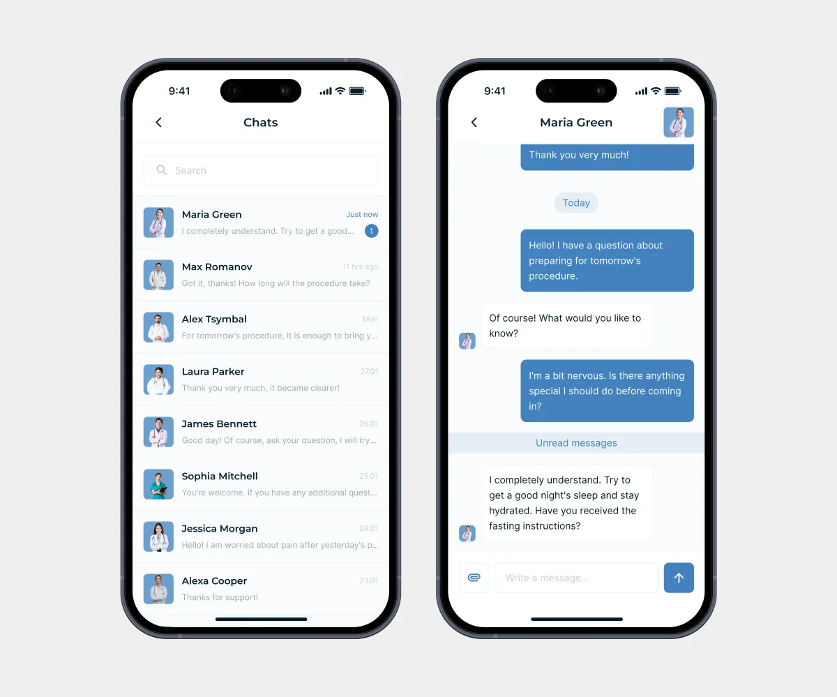
Chat with specialists helps patients quickly get answers to important questions, urgent help, or support. It includes only the essential features for formal communication.
Conclusion
Results:
- 14+ screens;
- The design was approved in the first iteration without revisions;
- A clean design fully aligned with the brand guidelines;
- All required features included in the product;
- The project was delivered on time.
What I learned:
- Optimizing the design process without compromising quality;
- Using a product feature mind map to skip the wireframing phase without compromising the product’s structure and logic;
- Prioritizing tasks and managing time;
- Putting myself in the users’ shoes to better understand their psychology and behavior.