POS system
Project overview
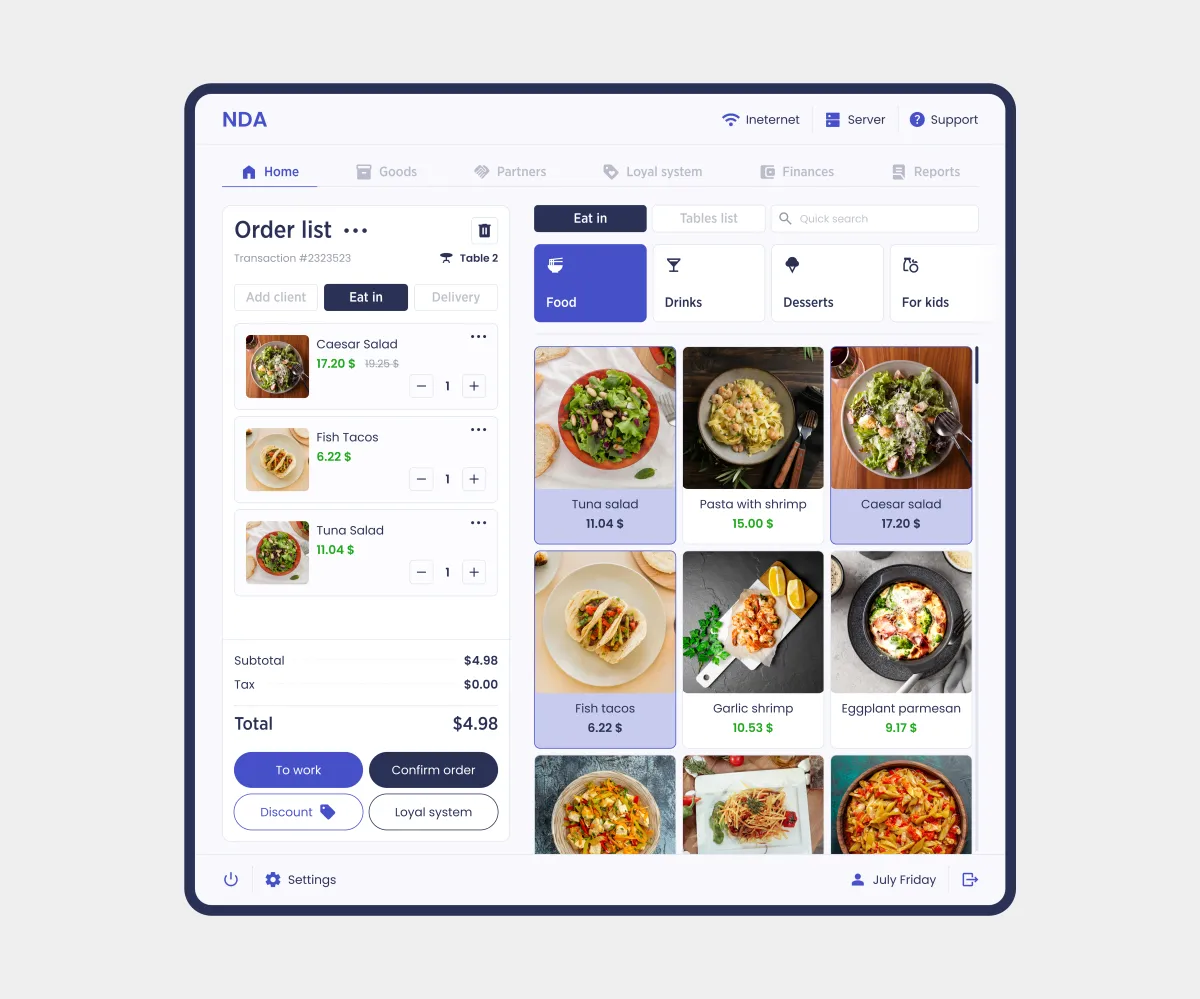
A POS system for automating restaurant and retail operations that simplifies staff’s daily tasks. The interface combines time tracking, floor management, fast order checkout, and product management.
My collaboration:
Aligned requirements with the Project Manager. Worked in tandem with the Team Lead, who was the second designer on the project: we created solutions together and validated them during joint design reviews.
Goals
Main task:
Design a modular interface structure and adapt it for touchscreens: POS terminals and tablets. Develop the information architecture, navigation logic, and element ergonomics to reduce the number of actions and ensure fast, error-free customer service.
Challenges:
- Stand out in the market;
- Create an interface for quick actions on tablets and POS terminals.
Constraints:
- Brandbook;
- Client sketches outlining the structure of some pages.
My role
Role:
UX/UI Designer
Key responsibilities:
- Meetings with the Project Manager and Team Lead;
- Competitor analysis;
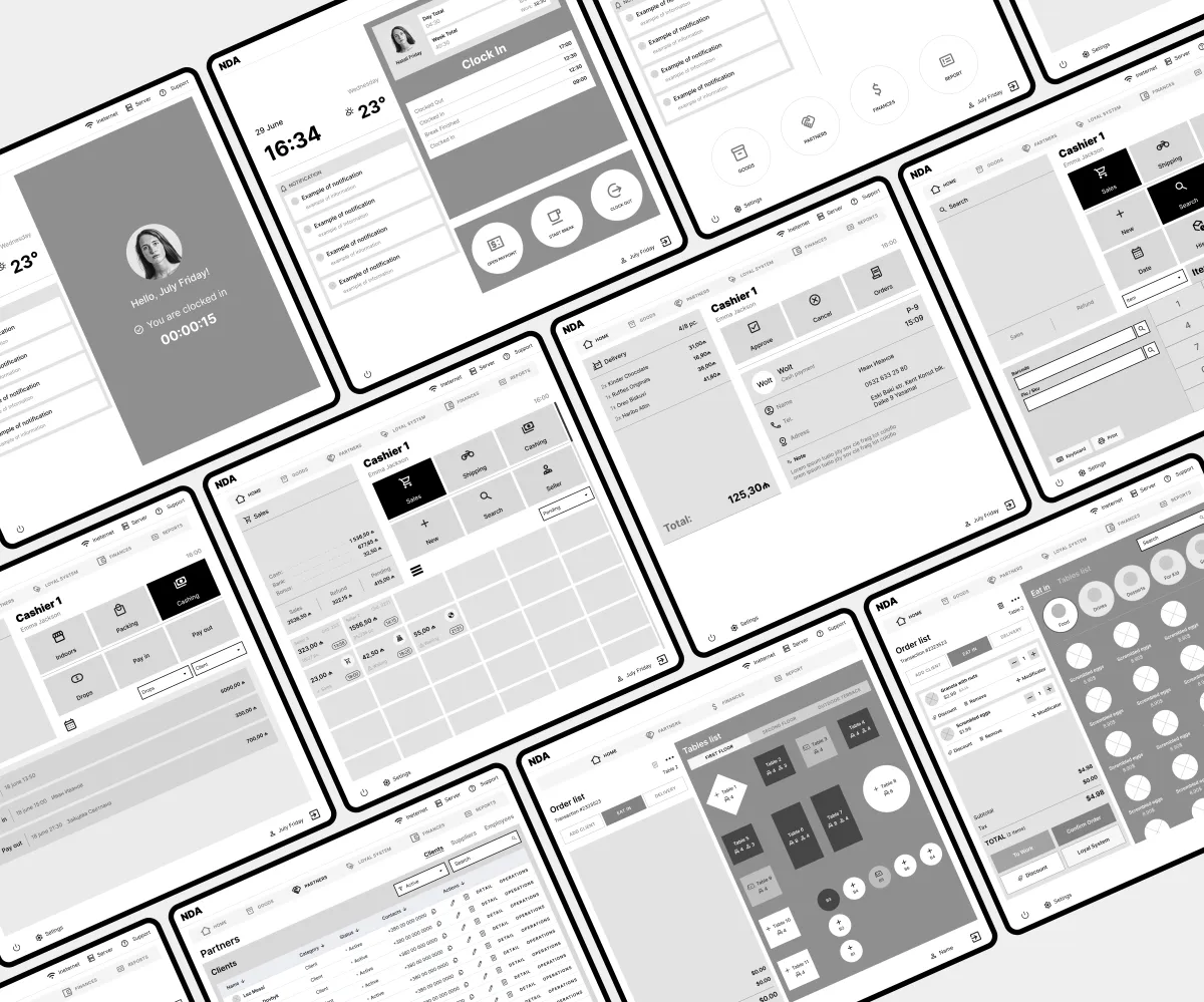
- High-fidelity wireframes;
- UI design;
- Dark theme concept.
Solution
My design process:
- UX: Brief analysis, meeting with the Project Manager, competitor analysis, wireframes for some pages.
- UI: Design concept, UI design for some pages, dark theme concept.
- Handoff: Layer organization, color variables, text styles, components.
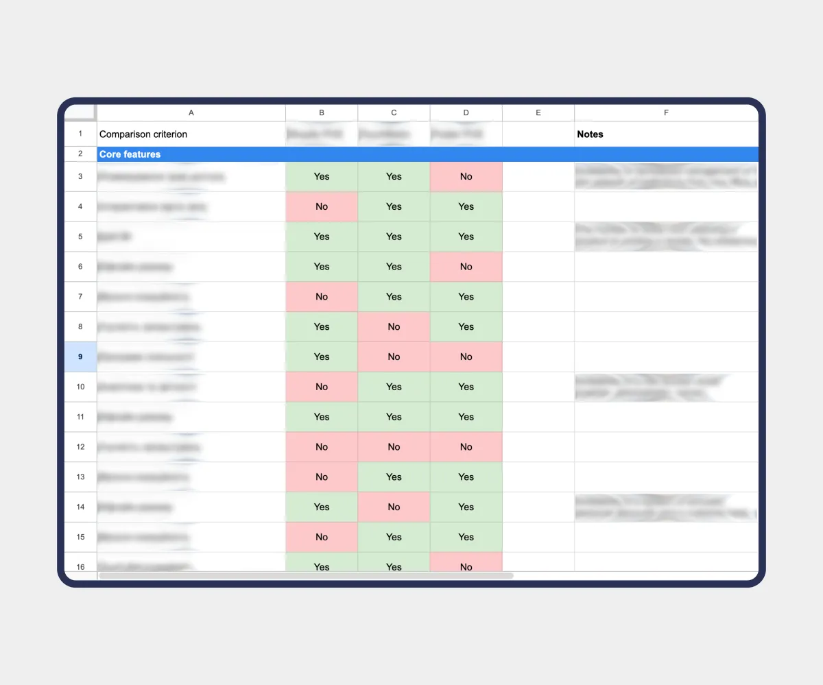
A direct competitor analysis using the POP/POD framework in two stages. First, features: which capabilities are industry standard and what unique advantages our system offers. Then UX: ergonomics and interaction patterns in existing solutions. This let us adopt proven market standards for quick staff onboarding while making the interface simpler than competitors’.
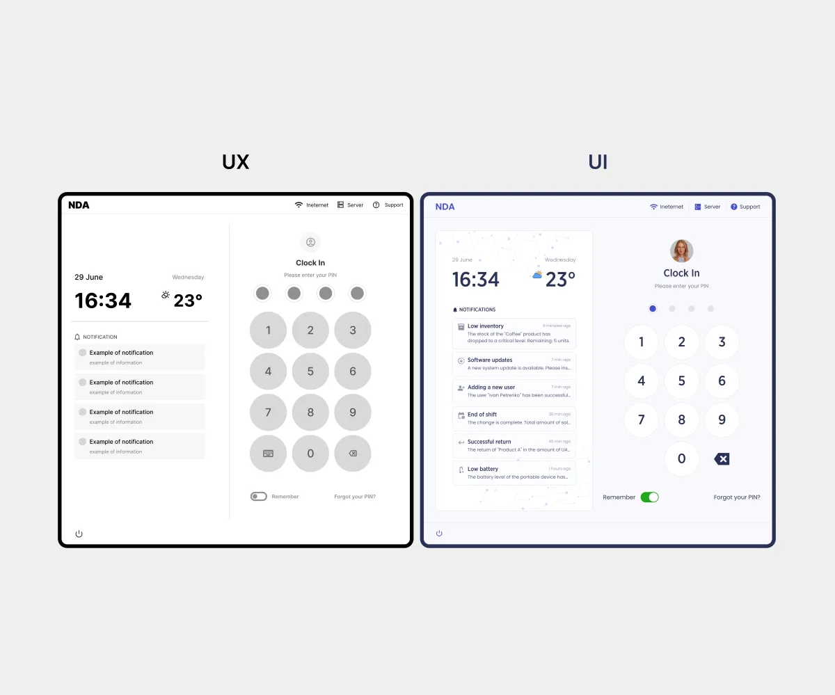
A large numeric keypad for PIN entry, a time widget, and a notification feed on one screen. Large buttons reduce login errors during peak hours, and cashiers see notifications such as menu changes or announcements before their shift starts.
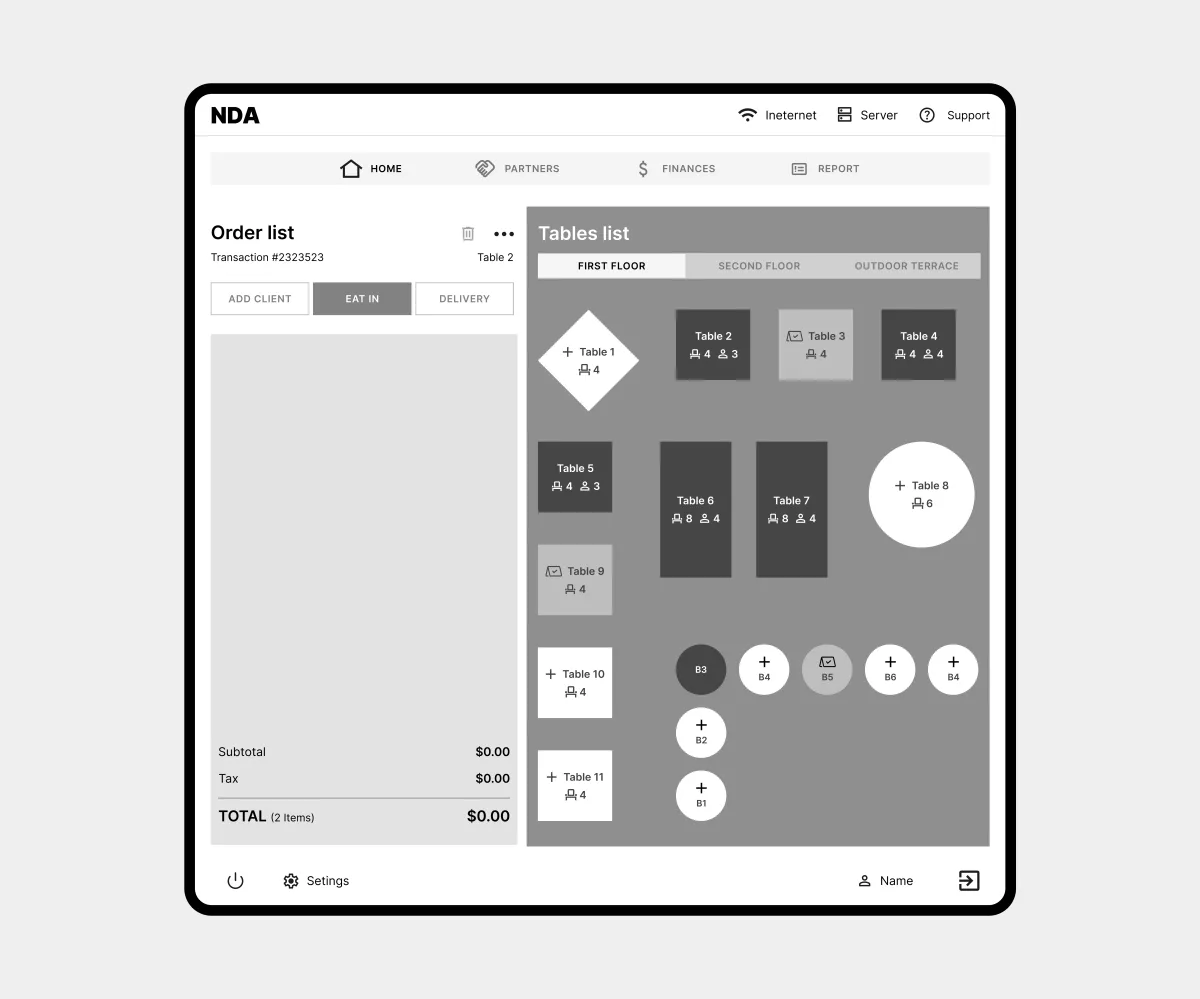
Tables are grouped into zones with tabs, and each table’s status is color-coded. Waiters and administrators see floor occupancy at a glance and find the right table quickly.
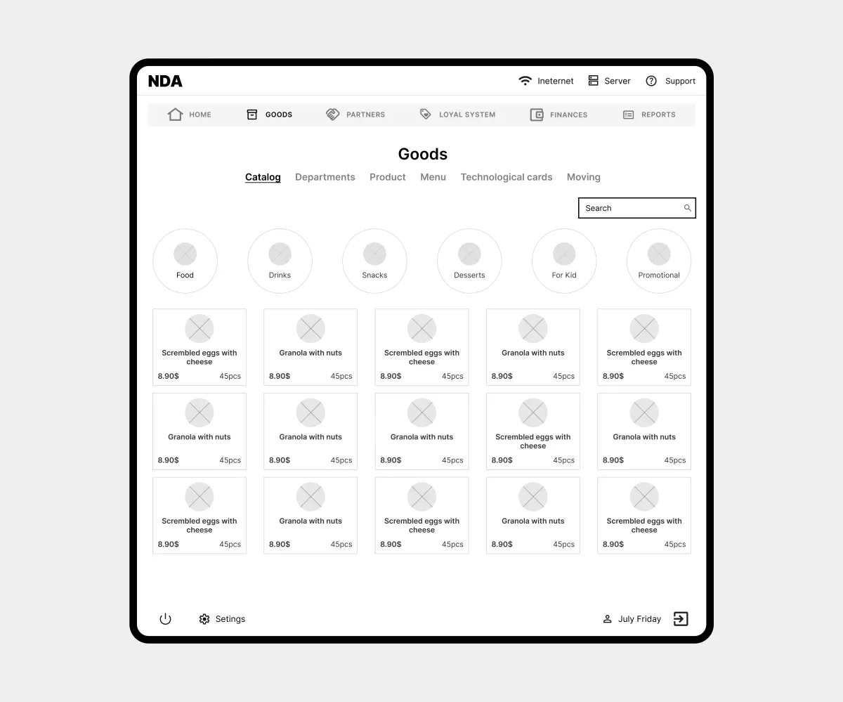
The product catalog and inventory include filters by category, brand, and tech card, plus search. Managers and cashiers can quickly check stock, weight, and prices even across a large range of items.
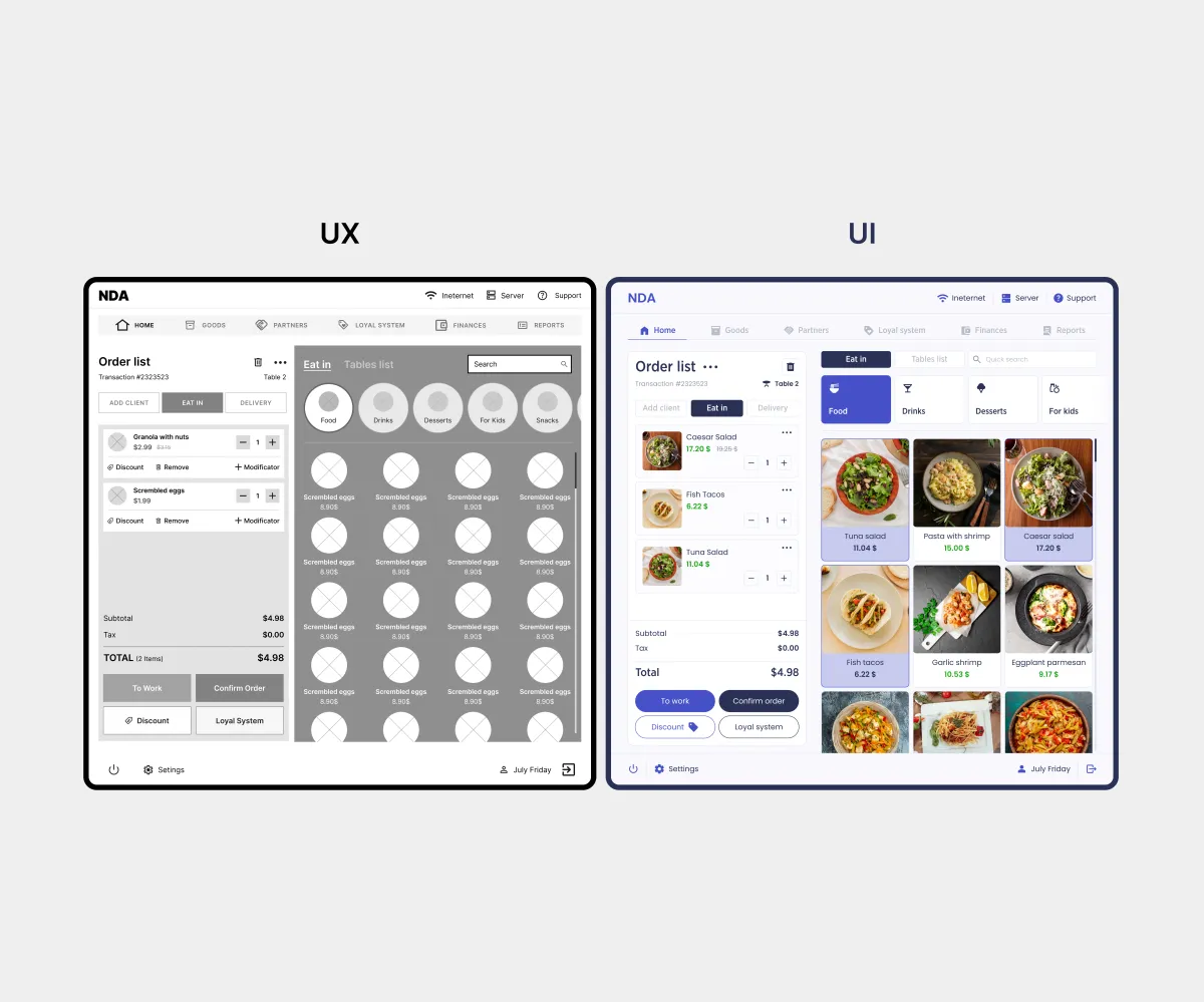
The screen is split into an item zone and the current check, with quick action buttons highlighted. The item grid speeds up search through visual memory, and modifiers right in the check let cashiers quickly customize orders for guests.
Conclusion
Results:
- 172 screens: 85 wireframes and 87 desktop layouts;
- Created a unified touch-first system;
- Addressed competitors’ weak points identified in the analysis;
- Adapted the interface to the brandbook.
What I learned:
- Designing complex POS systems;
- Conducting in-depth competitor analysis;
- Creating touch-first UX.