Telecom app
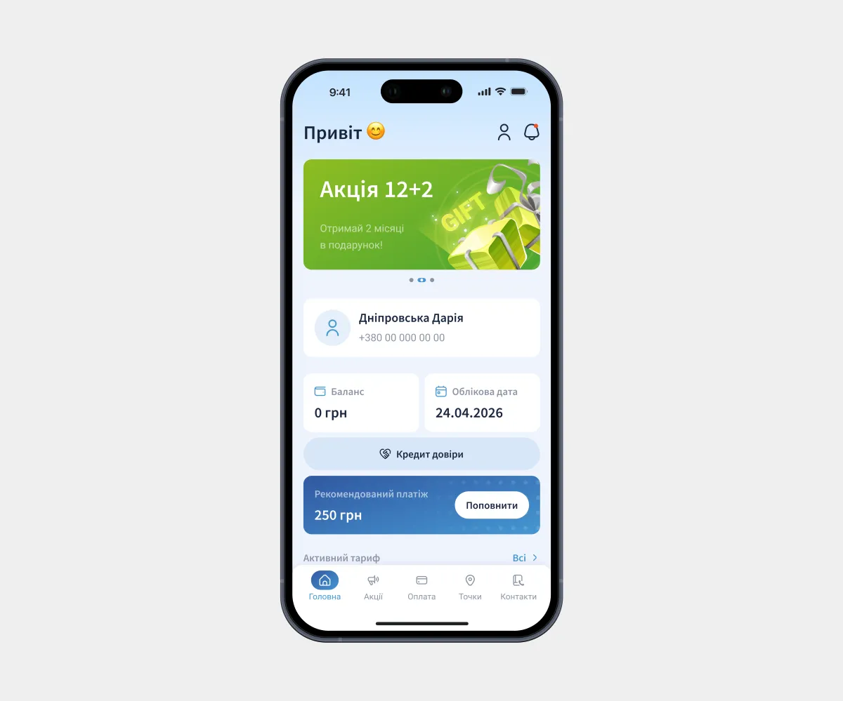
Project overview
A local internet service provider offering broadband internet, digital TV, dedicated public IP addresses, and other connectivity services.
My collaboration:
Aligned requirements with the Project Manager and validated solutions with the Team Lead during design reviews.
Goals
Main task:
Design a cross-platform mobile app and UI kit. In the app, users submit connection requests, manage their plans, track their balance, and access other provider services.
Challenges:
- Reduce the customer support workload;
- Support multiple contracts and addresses within a single account.
Constraints:
- Company brand guidelines;
- No wireframing phase.
My role
Role:
UX/UI Designer
Key responsibilities:
- Meetings with the Project Manager and Team Lead;
- Visual style;
- Design of all app screens;
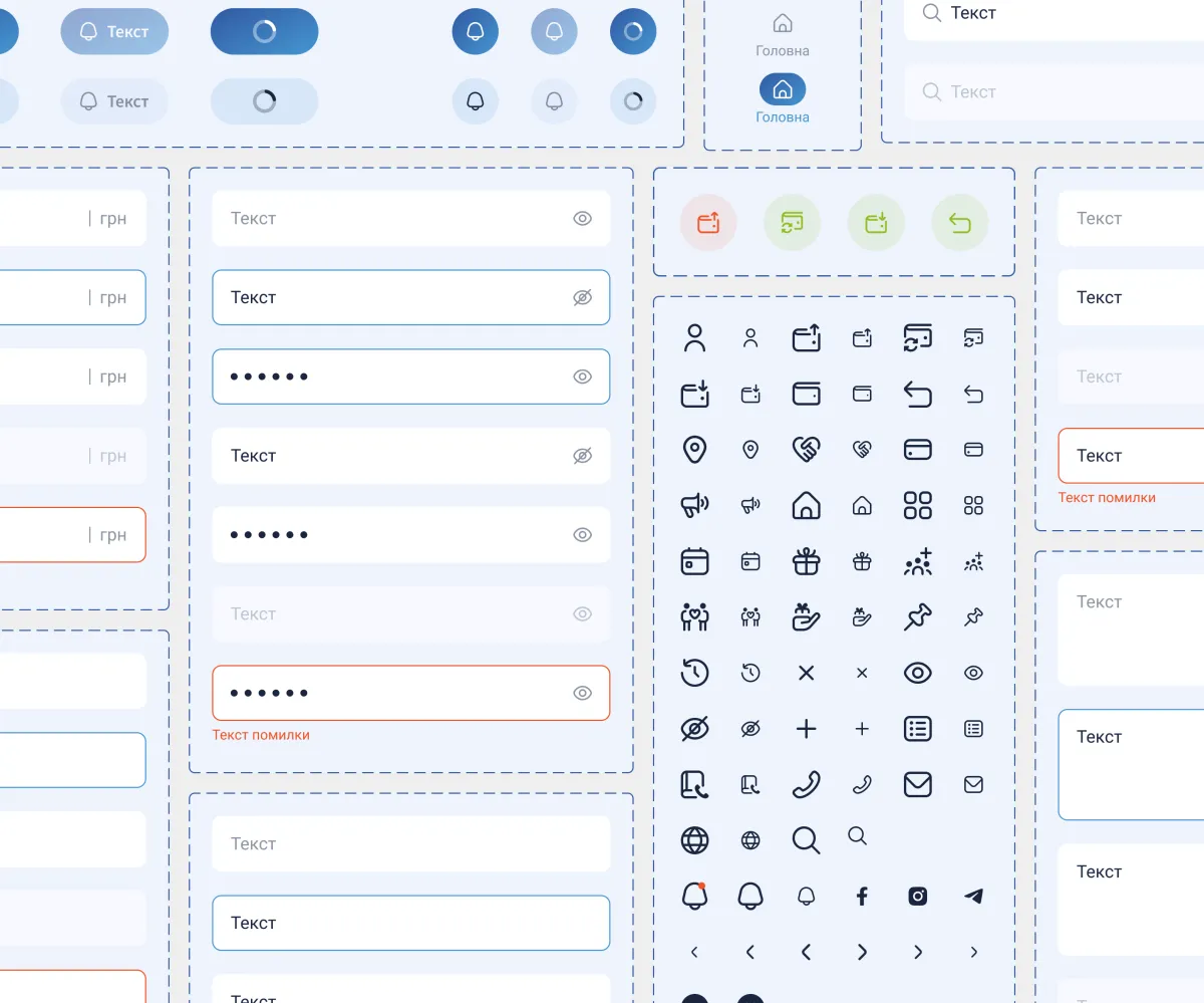
- UI kit;
- Preparing the design file for handoff.
Solution
My design process:
- UX: Requirements analysis, competitor analysis, interview with the Project Manager.
- UI: Design concept, design of all screens, design reviews with the Team Lead.
- Handoff: Layer organization, color and text styles, component states, UI kit.
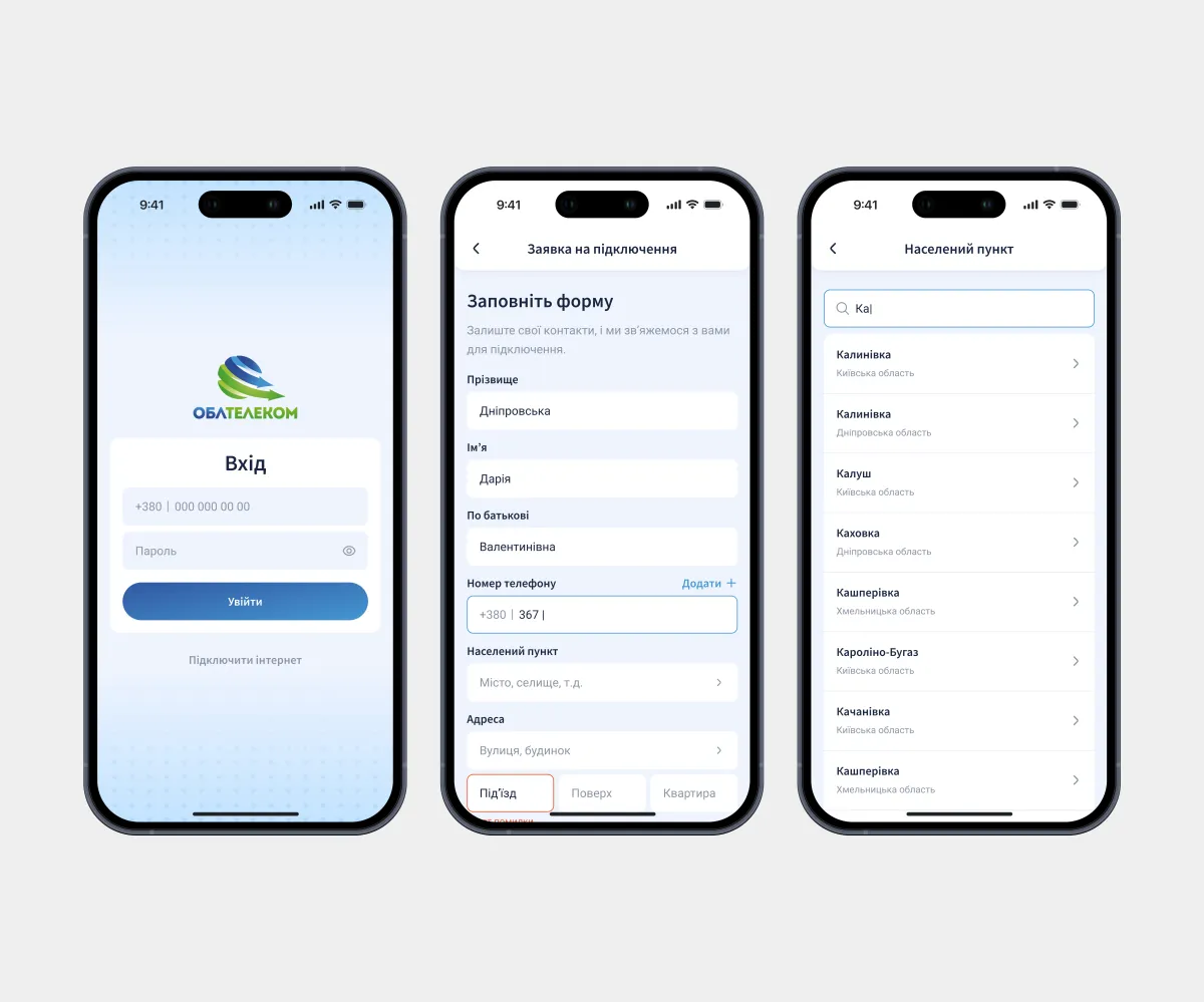
Users submit a request by entering their address and, once connected, manage their account right from their phone. Multiple phone numbers in one account suit households with several owners and users with more than one number.
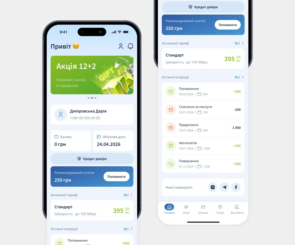
The home screen brings together key account information. From here, users can top up their balance or activate a trust credit in a couple of taps. Promo banners share new offers and make the interface feel more dynamic.
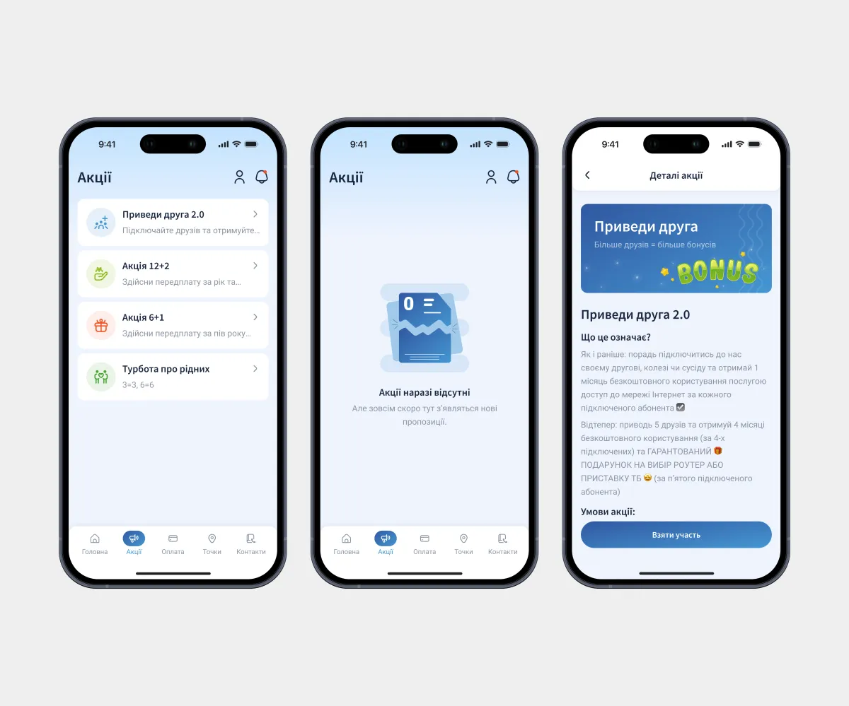
Promotions are presented as clean cards with icons. A typography system for articles covers headings of different levels, body text, lists, callouts, and quotes, so every article looks consistent and is ready to publish.
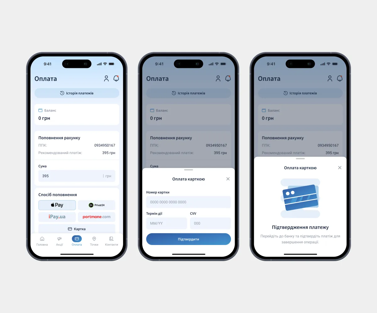
A dedicated screen for quick balance top-ups. The app suggests a recommended amount and offers various payment methods.
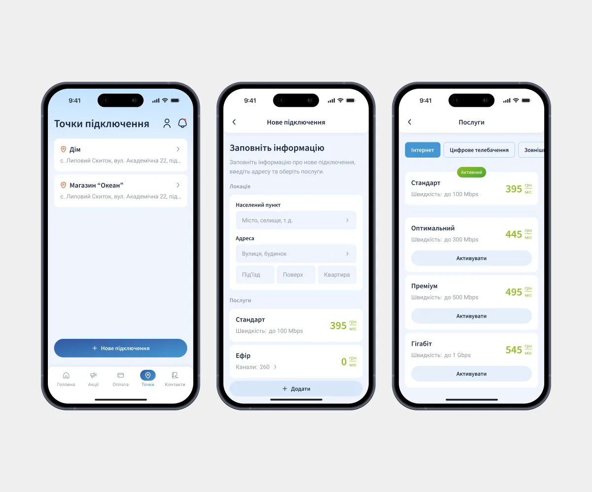
Here users manage their current services, switch plans, or add a new service for a specific address. They can also submit a new connection request from this screen.
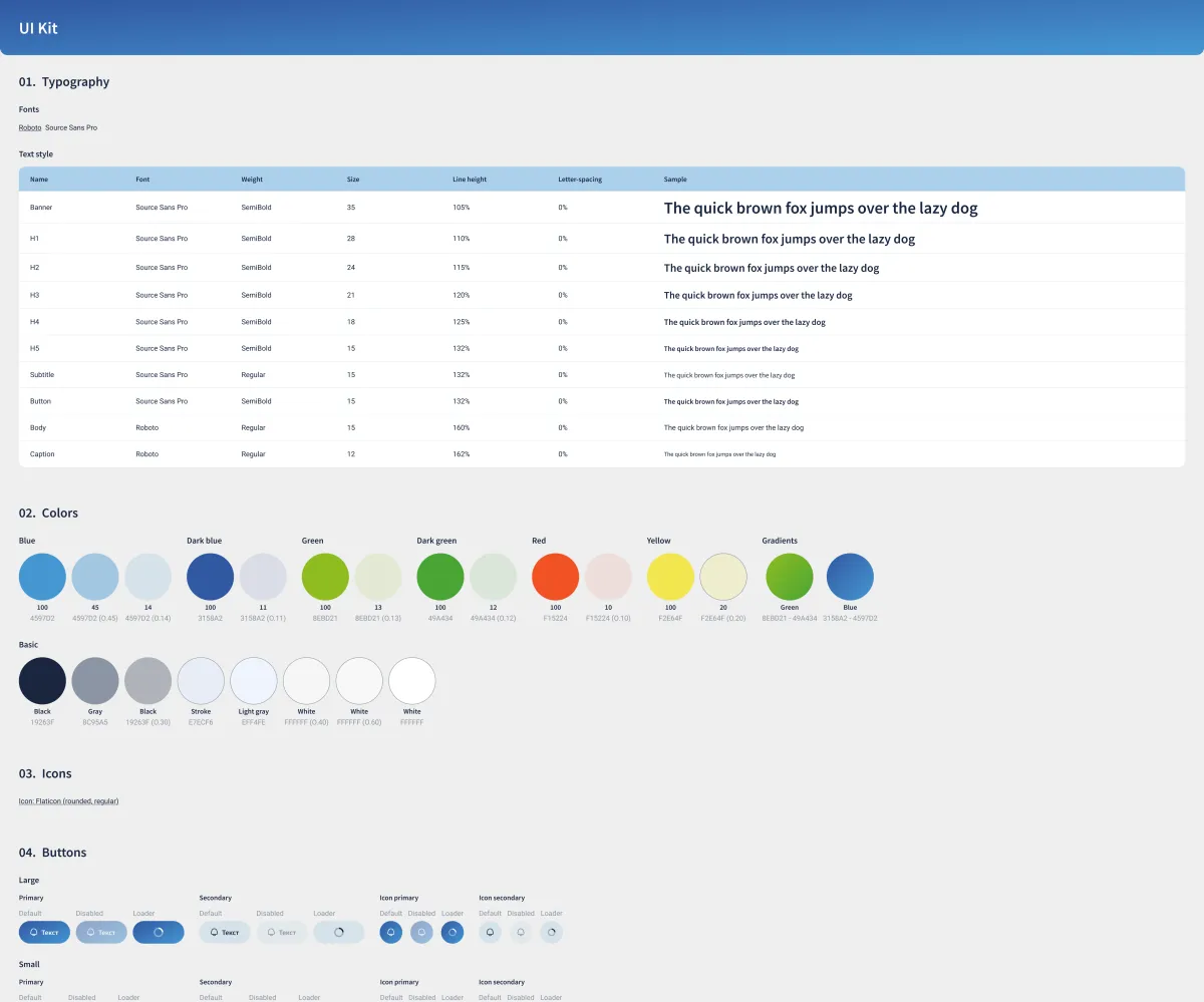
Variables, color and text styles, and every component state: everything developers and designers need to keep the product consistent as it grows.
Conclusion
Results:
- 30 screens;
- Approved after the first iteration;
- The app launched and reduced the customer support workload by 50%;
- The design fully complies with the brand guidelines.
What I learned:
- Strengthened my skills in UX design, visual hierarchy, auto layout, and color systems.